Menu


If you want your content to rank high on SERPs, It’s not enough to write and publish your content — you need to keep optimizing it too. One way you can do this is by tracking its performance. This article will show you how to use Google Data Studio to measure your content’s performance.
Content marketing is a big piece of the marketing puzzle. Tracking its performance helps you optimize your content, rank higher in SERPs, and boost traffic and revenue.
Tracking can help you identify weaknesses in your content. For example, let’s say there’s a problem with your headlines — they’re not appealing to your target audience. By tracking page views, you’ll see which headlines are working and which aren’t. Then you can make the improvements needed to get people to read your content.
Tracking content also allows you to identify which topics engage your audience — so you can give them more of the content they want. You can optimize your content to drive more views and engagement.
Google Data Studio is a free tool you can use to visualize your data in customizable reports and dashboards. You can add pages, charts, and tables which you can customize. It’s a great tool for getting a snapshot of your content performance. This article will show you, step-by-step, how to use Google Data Studio to track your content performance. You can also read our ultimate guide here if you want to learn more in depth about Google Data Studio.
Before you can start tracking, you need to decide what to track. This is going to be based on your marketing objectives and KPIs. We’ll break down the key metrics to track your content performance later in the article.
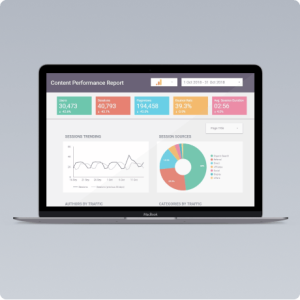
Although Google Data Studio is easy to use, you can save time by using some ready-made templates. For example, the Content Performance Report (GA) template includes a bunch of useful content performance tracking metrics in a cheerful and colorful interface. For laptop users, the Compact Google Analytics Page View Report is a simple, one-page template has everything you need. We strongly suggest using a pre built template, as these can be used as a base and then further customized to your needs. These templates can be used as a base for you to begin customizing:
We’ve also included instructions for building your own template from the ground up.
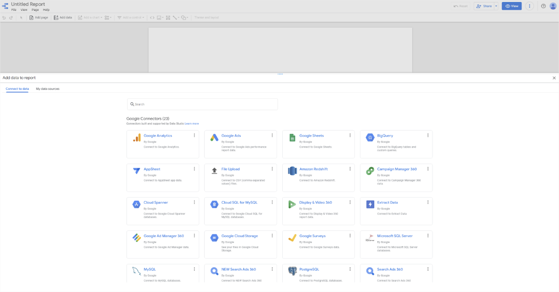
One of the great things about Google Data Studio is that you can connect with a ton of data connectors. Today, let’s keep it simple and connect with Google Analytics. When you create your new report, a pop-up will ask you to select a data source. Click Google Analytics. Then select the correct account and property.
Because we’re only interested (for the sake of this article) in your content performance, we need to filter your data. Luckily, Google Data Studio makes this super easy.
It’s important to note here that if you don’t have your content on a subdomain — for example, www.company.com/blog/ — this is going to be tricky and you’ll need some technical help.
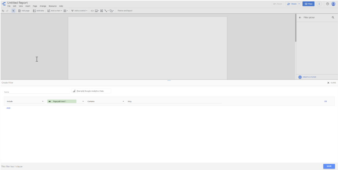
Let’s add a filter to the whole report so it sources only the data related to your content.
In the File menu, click Report settings. On the right hand side of the page, a menu will appear. Click ADD A FILTER and then CREATE A FILTER to get started.
Remember, we only want to include data from your content subdomain in this report. To the right of Include, choose Page path from the dropdown menu. Two more fields will appear. In the first, select Contains and in the last one enter whatever your subdomain is — “blog” for example.
Next thing is to choose a time period. In the toolbar, select Date range control from the Add a control dropdown menu. After adding the box to your report, select it and you can set it up. When it’s selected, the setup menu will appear on the right. Here you can choose the default range.
You can change the data range in a couple of clicks by clicking the date control on your report. Here you can get more specific or customize your date range.
So far you’ve set up the basics. Next, it’s time to see what’s happening with your content.

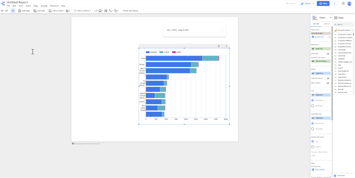
The beauty of Google Data Studio is you can see how your content is performing using tables, charts, and even maps. All the standard graphs are included — line, bar, pie, scatter and area — plus others like gauges, bullet charts, geo charts, and treemaps.
So let’s add a chart. Click Add a chart in the toolbar and select Stacked bar chart from the dropdown menu. On the right you’ll see the Chart Setup menu. As you can see, design is a big part of creating a report dashboard. For people with no design experience, using an existing template is a big time saver — this blog performance template is an example of an easy interface you can use to get started. It’s easy to set up.
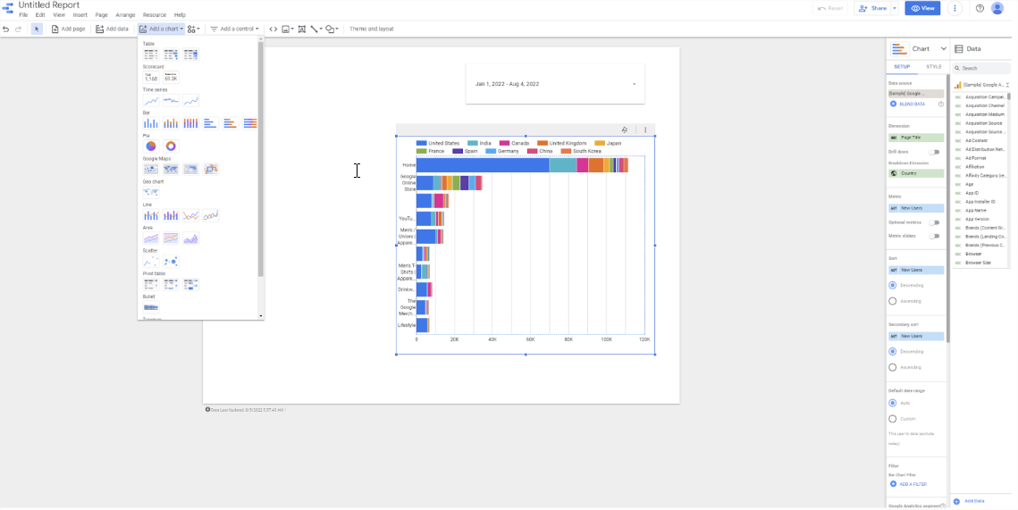
Before you choose which dimensions and metrics to show on your chart, let’s talk about the difference between them. Dimensions group your data into categories. For example, you could do this by date, country, or type of device. Metrics are the numbers we want to find out. For example, page views, unique users, or engaged sessions. What’s important for your business depends on your marketing objectives and KPIs. In Google Data Studio dimensions are green and metrics are blue.
Here are some useful metrics when tracking content performance:
Let’s say you want to find out which pieces of content on your site are most popular and what devices your viewers are using. To do this, go back to the stacked bar chart you added. In the setup menu, choose Page title as the dimension and Device category as the breakdown dimension. Then as the metric choose Pageviews. This chart shows you how many views each piece of content has and from which device.
Here’s how you can use that information. If you find some content isn’t getting any visitors, you can figure out why. Take a look at the headline and compare it with content that is getting visitors. Here you can see ways to optimize the headline to get visitors. Or if you notice some content is more popular with mobile users, you can go back over the content and make sure it’s optimized for smaller screens.
This is just one example of how you can use Google Data Studio to track your content performance. There are tons of other ways to track and visualize your content KPIs that are outside the scope of this article.
To learn more about Google Data Studio, check out our ultimate guide. And to get started tracking and optimizing your content, browse our time-saving templates.