Menu


Google Looker Studio (formerly Data Studio) is a fantastic tool for centralizing and presenting your data. It is also fairly easy to use, although there is a bit of a learning curve. This guide aims to flatten this learning curve and help you get up and running with Looker Studio. We have made it both easy to follow and comprehensive at the same time. It contains everything you need to know to start building reports and use the tool to its full capacity.
We’ve found Looker Studio to be an excellent tool for digital marketers, but also great for anyone working with digital platforms and data presentation in general. This can include marketing platforms, spreadsheet data, financial services, and more. The guide will be useful for anyone working in these areas. Whether you are a freelancer, consultant, analyst, or agency employee, the ability to centralize, track & share data, will be extremely useful. This guide has been written with you in mind.
The guide is written for beginner to intermediate level users but it will also cover basics of advanced topics. We have included links in each section for further advanced reading, in case you want to delve into more detail on certain topics.
Coverage: We start with the basic steps for setting up a Looker Studio account and connecting data. We’ll then cover the charts, customizations, and presentation tools that bring your data to life. We’ll also touch on design capabilities and resources that help you create turn-key dashboards. Finally, we’ll explain how you can share reports. Our guide is thorough, but not exhaustive.
Google Looker Studio is a free tool that enables you to create centralized reports from web, ecommerce, marketing and a range of other data sources. Data Studio dashboards are visually appealing, easy to share across the web and fully customizable, allowing you to bring your data to life and tell a story.
Google Data Studio helps marketers accomplish three critical jobs:
Data can help to back up a point of view, showcase results, and provide information and analysis on which action can be taken.
To create an account, go to https://datastudio.google.com/ and click “Use it for free.” Data Studio will use your Google Account to sign in.

Once you’ve signed up or logged in, you’re presented with the following screen:
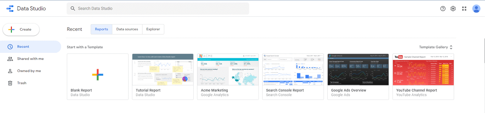
For now, start with a blank report by clicking the “Create Button” at the top left or the “Blank Report” from the list of templates in the center. We’ll cover what a Looker studio template is later in the guide.
The last thing to get you started is to understand the different elements on the main dashboard editor. If you’re familiar with the Google Suite, this view should be at least a little familiar. Across the top we have a toolbar, and on the top right is a share button as well as a “View” button. By default you are in “edit” mode.
Clicking “view” when editing a template gives you the front-end experience which is what your audience will see when they access your report later.
On the middle of the screen is a grid. This is your report. It’s where you’ll drop in charts, tables, images, and other design elements we’ll discuss later.
On the right sidebar is the “Editor.”
When you have nothing selected in the main grid, it lets you edit the theme and layout of the page.
When you’ve selected a chart, the right bar is where you’ll play with the data, including adding dimensions and metrics, filters, calculated fields, and where you’ll style the individual chart. Don’t worry, we’ll explain this in detail later on.
Before you start building a dashboard, take a step back to identify two things.
Those two questions proceed any data connecting, visualizing and sharing. While you may not know exactly what that looks like yet within a report, having data and an audience in mind will make this guide more practical.
For example, if you’re building a report for an eCommerce site and you want to present sales performance, you’ll include vastly different data and charts than a report for a blog presenting user engagement. In your ecomm report you want to present sales data, lists of top products, data that helps you understand your funnel and drop off points, and more. A blog report would stay focused on pageviews, acquisition channels, and CTA’s. These are two different stories. Each has to shine through in the data and presentation.
Likewise, the audience will guide your visualization… Are you reporting to a high-level manager? Perhaps they don’t need as much depth as they do clear, key metrics and a broad performance overview.
On the other hand, are you building this as a single source of truth for a team to use as they strategize and create campaigns? Technicians require specific details, data exploration tools, and the information should be spread across multiple report tabs.
We asked ourselves the same two questions as we wrote this guide. We’ll mostly stick to presenting Google Analytics website data and we have imagined you, our audience as someone who may be learning how to use Looker Studio for the first time.
The first thing you need to do to start building a report is connecting data. A data source, or a connector, as Google calls it, is the building block of a Looker Studio dashboard.
Anything you can put in a spreadsheet can then be visualised in Looker Studio.
There are two types of data connectors for Google Looker Studio:
Google connectors can import your data from Google Analytics, Google Ads, Search Console, YouTube, Sheets, and more.
In aggition to the standard Google Product suite, Google has added some other native connectors for third party data sources suchg as SQL, MSQL, Big Query, and CSV upload connectors.
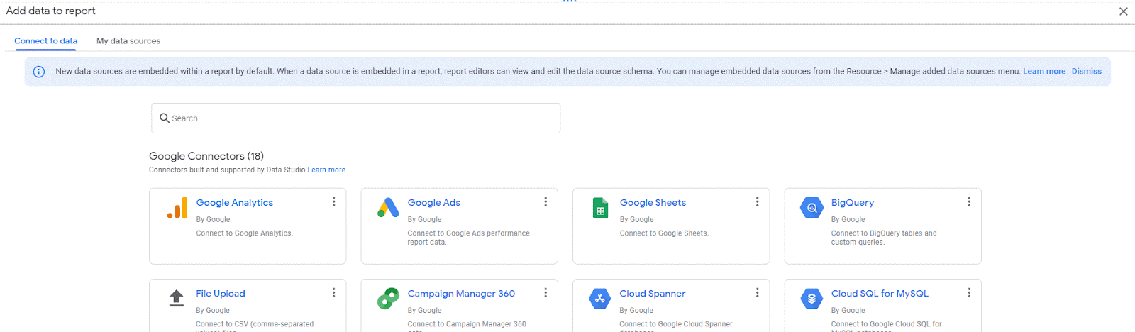
Select a Google Connector, or scroll down to find a Partner Connector to use.
If your business uses Google products in your marketing, you should be able to create a very comprehensive dashboard that meets all your reporting means. Often users prefer to populate data in Google Sheets, and then connect the Sheet as the data source as opposed to paying an additional fee or directly linking into a third party API.
You’ll notice that Google hasn’t built connectors to other 3rd party digital tools like social media platforms, other ad networks, or SEO platforms. That’s where the Partner Connectors that are managed by third parties and usually require a subscription fee come into play. We’ve written a comprehensive guide to understanding Partner Connectors, so we’ll just summarize three main points here.
If you have a niche platform you want to connect to, you can also build your own connector or pay an expert to create a custom data connector for you.
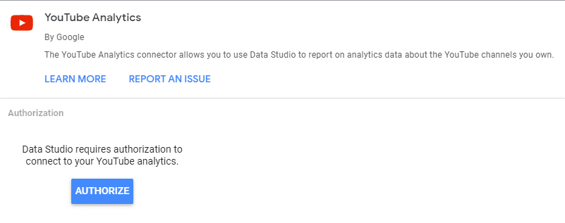
Whichever connector you choose, Google will first ask you for authorization to connect to the data. You only need to grant access once. After that, Data Studio lets you begin to use it in charts and tables on the dashboard.
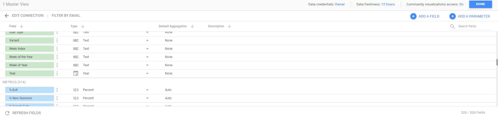
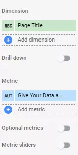
When you connect data, one of the first things you’ll notice is a list of available fields you can use on charts, tables, scorecards, and the other data displays within Looker Studio. Google separates the data into two categories, dimensions and metrics.
Google separates data fields into two categories. Dimensions are always colored in green, metrics in blue.
A dimension is anything text-based, be that simple words like the “Page Title” or “Country” or even a date like “March 25, 2021.” Looker Studio specifies three specific types of text dimensions:
The important thing to note is they aren’t numbers.
There are other dimension types, that while less common, can still be helpful. One is simply the ability to specify text as a URL. This enables your audience to click the URL and open it in a new window, a handy tool if you need to refer to a page as you analyze data. The final category is a boolean, or in more familiar terms, a true/false, yes/no value.
Data Studio underlines URLs, letting your audience know it’s a clickable link.
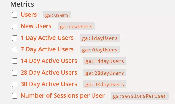
A metric, on the other hand, is anything number or value-based. Like dimensions, there are more specific types for metrics, namely:
If we use Google Analytics as an example and look at statistics on how users are interacting with our website, Google creates a number of user metrics (and even dimensions) you could use in your report. Looker Studio has a search bar helping you track down metrics and dimensions quickly. Or, you can always scroll through them all.
Google Looker Studio allows you to edit both the data label and the data type once it has been connected to your report.
When you add a new connector, especially one of Google’s free data connectors, Looker Studio will automatically label and assign a type for each data point based on the API. The same is true when you use a Partner Connector. When they built the connector, they assigned each data point as a dimension or metric and gave it a name.
If you are importing data from Google Sheets or a CSV, the column headings are used as data labels which isn’t always ideal and needs to be edited. Or if for some reason, something is miscategorized or named wrong, you can edit both the type and the name. When you’re looking at all the available data during the connection process, you can start making edits there by clicking the drop-down on the Type field. Or, once you’re working on a chart, you can edit it there by clicking on the small box next to the field name in the Data Editor on the right sidebar. This allows you to both give the data point a new name or change the type.
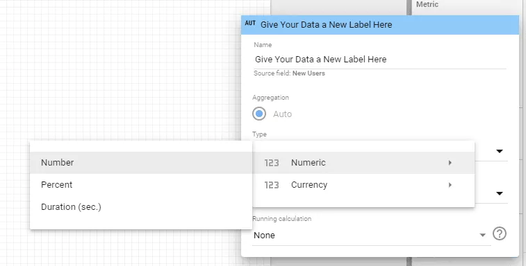
Besides correcting the name or type, you may find you want to relabel data based on your audience. For example, Google Analytics labels Goals, “Goal 1,” “Goal 2,” etc. You can give the metric a new name like “CTA Click” or “PDF Download,” whatever the goal actually represents.
Now that you understand dimensions and metrics, you’re ready to build a chart, the main visual component of a Looker Studio Dashboard. Across the toolbar is an “Add Chart” dropdown where you can select the data you want. Once you’ve determined the chart, you can add dimensions and metrics on the right sidebar. If you’ve picked the wrong chart, don’t worry, you can quickly change it on top of the right sidebar editor.
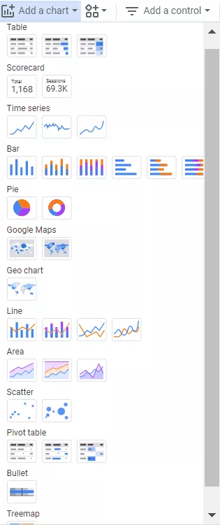
Google offers 13 types of charts, with a few variations to each. They are:
Most of these charts should ring a bell, but we’ll cover a few nuances you may not know.
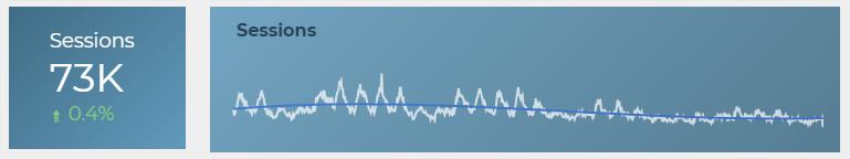
First, a scorecard displays a single metric, say “New Users,” or “Total Revenue.” It’s a great way to display a critical data point and draw the metric extra attention.
You’ll find that most reports use scorecards one way or another and it’s important you gain a strong understanding of how they work.

A time-series uses a date across the X-axis to create a line chart, including a sparkline and smoothed styled chart.
Google Maps differs from Geo Charts in regards to the detail on the map. With Google Maps, the map looks similar to the actual Google Maps product, allowing you to zoom in and see county lines and roads. The Geo Chart uses a more straightforward map that can’t be zoomed. It’s best for general data.
If you want to deep dive on charts and learn more about each option, check out this article on advanced data visualization.
The real magic of Data Studio comes when you enhance the visualization of your data. While you have many charts and tables to choose from, you can also make stylistic changes to improve the data’s appearance. After clicking on a chart, selecting “Style” on the right sidebar opens up an editor.
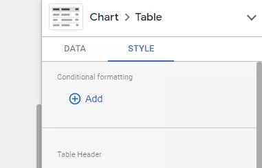
Each chart has slightly unique style changes you can manipulate. Common among them are colors, backgrounds and borders, and text sizes on chart tiles and legend. Each also lets you get specific about how much data you want to share. Do you want to label data points? Show percentages on each slice of the pie chart? Include a line of best fit on a scatter plot? Add conditional formatting? That’s all available in the Style Editor.
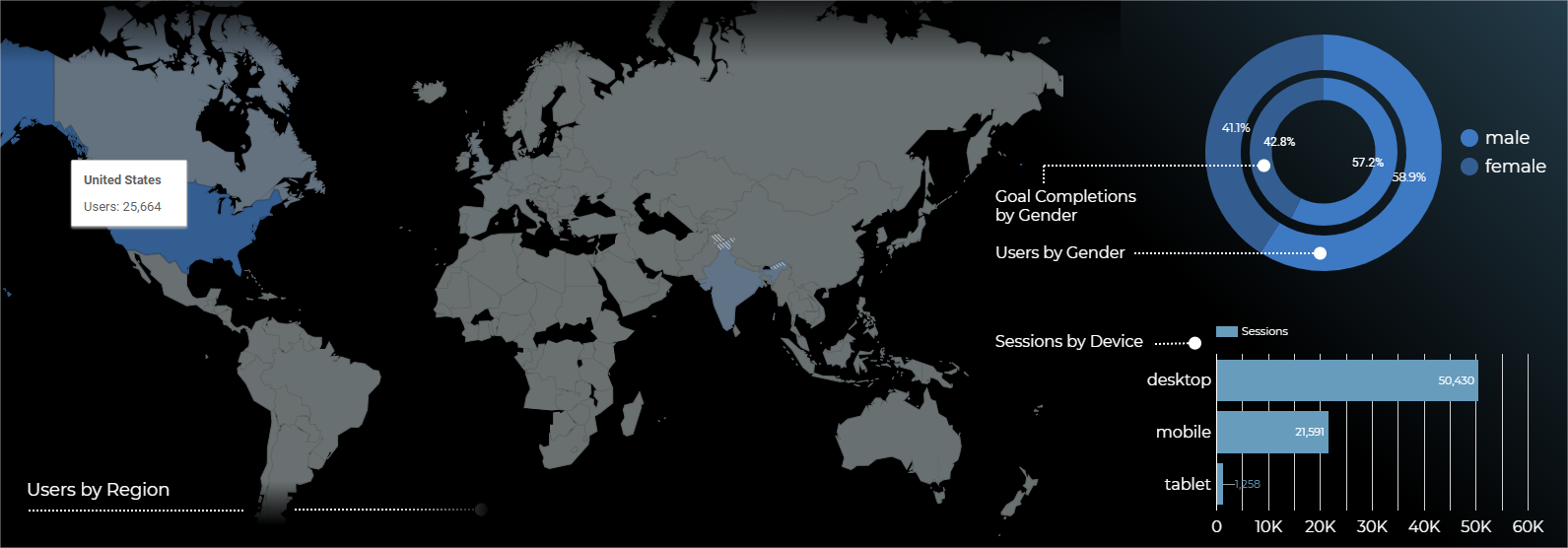
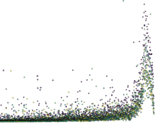
This chart makes use of a number of Looker Studio’s charts. Plus, it spruces them up with color.
One additional resource at your disposal is community visualizations. These are charts Data Studio users have made that are a little more creative than the 13 Google’s already added to the platform. Community Visualizations are in Beta right now, and you’ll only find a handful of new charts. However, there are some handy visualizations like a funnel, gantt chart, and venn diagram. If you’re feeling creative, you can even make your own. We take a comprehensive look at community visualizations in this post.
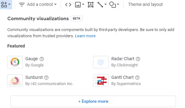
Find Community visualizations on the top tool-bar when editing your Looker Studio report.
In addition to stylistic changes, you can also use a few options to manipulate the display of your data within a chart. These tools help you be more precise with the data you show and let someone viewing the chart explore the data. These options are found on the right sidebar Data Editor.
You can use a filter to either include or exclude data depending on their dimension or metric.
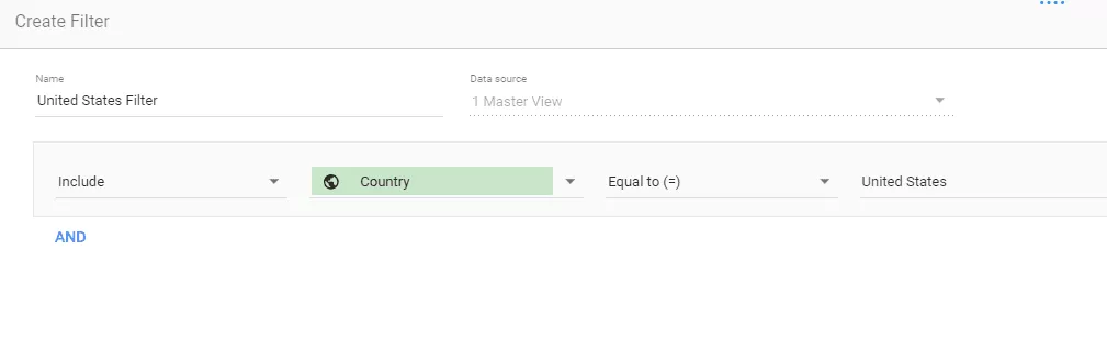
Let’s say, for example, you only wanted to include “Pageviews” from the United States on your table of top website pages. You’d create a filter with this logic: Includes, Country, Equal to =, United States. Each filter needs all four steps, include/exclude, dimension/metric, Match (equal to, starts with, contains, is null etc), and Value.
You can take your filters to the next level in two ways. First, each filter can contain more than one line of logic, connected by “And” or “Or”. For example, if you want your chart to include anyone from the United States, AND a mobile device. Perhaps you want to include anyone from the United States OR Australia. If you want to keep your filters simple, you can create multiple filters and apply them to the same chart.
Filters don’t just work on Google Analytics data. You can create a filter for any data connector using the dimensions and metrics it contains. To learn more about filters, check out this more in-depth explanation.
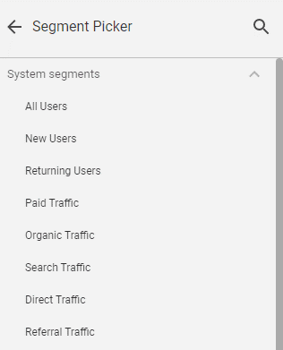
Segments only apply to Google Analytics data. Those familiar with Google Analytics know that a segment is a subset of users. Google already created several you can apply to your Looker Studio charts. In short, think of these as premade filters. They include users by traffic type, number of sessions, device, and more. Additionally, you can create custom segments, either in GA or in Looker Studio.
If you change the data with a filter or segment, be sure to specify exactly what the chart is showing by relabeling the data or, more practically, creating a text box header (we’ll get to that soon).
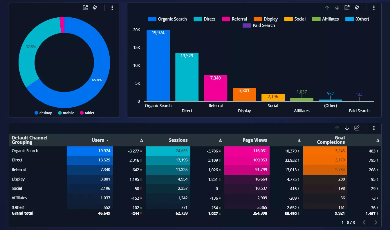
Finally, you can display historical data on Looker Studio charts by choosing a date range in the Data Editor. For tables, this displays as its own column as a % Delta, or % change. For other charts, it displays as a small red or green arrow with a % change beside it.
In addition to filtering, you can also add some tools to the chart that enable your audience to manipulate the data themselves.
One neat trick is adding optional metrics to your chart. Let’s say you don’t want to clutter a table with too many data points, but think your audience may want the option to see additional data. By adding an optional metric, they can toggle it on and off on the chart themselves.
Another available manipulation to your metrics is metric sliders. By clicking on the metric slider, your audience can set a range of data they want the chart to display. For example, they may want to see “Pageviews” but only for “Pages” between 50-100 views.
Another option is adding a drill down to a dimension. A drill down only applies to a few dimensions that have a hierarchical structure, say Geo data. Google labels “Continent, “Sub-continent,” “Country,” and “City”. Instead of including all those metrics on a chart, you could consolidate them with a drill down. In this case, Looker Studio will only display one dimension but include arrows above the chart which help users navigate deeper into the data, or literally drill down. Like optional metrics, this keeps your chart clean while still giving your audience access to lots of data.

Notice the drill down arrows and metric slider at the top of the chart. The third column displays historical data.
Looker Studio also features tools that live outside of the chart, but still help alter the data displayed on the chart. These are called controls. The whole purpose of a control is to let your audience change the view as they analyze the data.
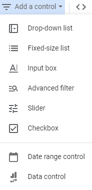
There are two levels that Controls can be applied to in Looker Studio:
Let’s start with the report level controls that alter every data point on the dashboard. There happens to be only two, and both of them are some of the most common controls you’ll use.
To add a date range control, simply select it from the “Add a control” drop down menu when editing your dashbaord.
Adding a date range control to your dashboard let’s you or the audience set a date range for all the data on the chart. So, you may initially set the dashboard to consider the last 30 days of data, but perhaps your manager wants to see the last six months. They can quickly implement that change using the date range control.
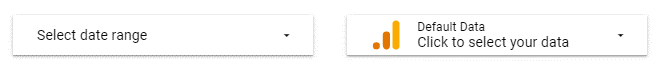
Similar to the date range control, simply select “Data Control” from the “add a control” menu drop down when editing your dashboard.
The second report level control that will alter all the data is called the data control. Despite it’s vague name, it’s extremely helpful if you manage multiple brands. The data control lets you switch between profiles within a single data connector.
That means if you have multiple Google Analytics profiles or views, you can toggle between them. The charts stay the same, but the data that’s displaying will change based on my selection within the data control. An excellent use case for this could be if you’re an agency and have multiple brands but only want to have a single Looker Studio dashboard instead of building 5-10 separate dashboards.
It’s not just Google Analytics – it works with any Data Connector. Let’s say you’ve got multiple Facebook pages you manage. You could toggle between them using the data control, assuming you’ve authorized access to each.
The rest of the Data Studio controls only manipulate a single dimension or metric. Consequently, that often means they will only edit a single chart. If you use the same metric or dimension across multiple charts, these controls will alter all of them. That may sound confusing on paper, so let’s dig into each control and some use cases. There are six chart level controls.
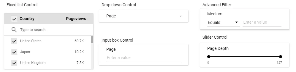
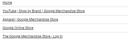
A drop-down list lets you select a control field dimension that’s found on one of your charts. Users can then select which instances of that dimension they want to keep in the view. For example, imagine a chart displaying all the top pages alongside data like “New users,” “Session length,” and “Pageviews”. Using a drop-down list, you can let users select which pages (the dimension, in this case) they want to keep looking at.
Now, if you had multiple charts that used pages as the dimension, the drop-down list would affect all of them. In our example above, if you had two tables with pages as the dimension, the control would alter both. If you had a chart that used a different dimension, say page title, you’d need a new drop-down list specifically to let your audience choose from the page titles. In other words, one dimension per drop-down.
A fixed-size list is identical to a drop-down list except that it already appears open. It saves the audience a click and encourages them to start altering the data view.
The purpose of the input box is to let users type in the value they want instead of selecting it from a list. However, like the drop-down, you can only select one dimension. Let’s keep going with our page dimension. If you choose pages, the audience can type in a value they want to look at. They may have a specific page in mind they want to see in the chart.
Like the input box, the advanced filter requires the audience to enter a value. This time, however, they have a little more control over what that selection does, essentially building their own filter. They can filter by equals, contains, starts with, and more. This provides them more control as they search for data. Again, you can choose only a single dimension to let them filer within.
We’ve already encountered the slider at the chart level, but there’s also a control slider. This one operates much the same. By selecting the metric you want the audience to control, they can establish a range or limit they want to see. The slider will affect any chart that contains the metric you’ve chosen.
The checkbox is the most niche control on the list, only usable for boolean values. In other words, you could let the audience select all the true values or all the false values, and filter the charts containing the boolean accordingly.
If you’ve got the hang of dimensions and metrics, charts, filters, and controls, you’re ready for some of Looker Studio’s expert tools. While it may be a friendlier analytics tool than most, that doesn’t mean it’s lacking the technical capabilities that a data tool should have. Seasoned analysts, those experienced with Tableau, Excel formulas, and the like, will find these tools familiar and decently robust. Newcomers will find they’re not so intimidating as they may appear at first glance.
A calculated field is Data Studio’s name for a combination of data that creates a new dimension or metric. In Excel, you’d simply call this a formula. Calculated fields have a specific syntax, logic, and se of available commands. We’ll keep it simple here, but know that you can perform many similar functions to Excel when you’re working with raw data like a spreadsheet or an ecommerce data connector in Data Studio.
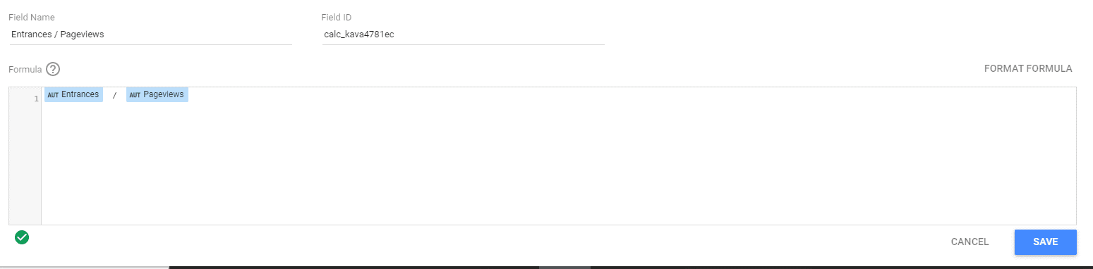
As it turns out, Google Analytics already creates some calculated fields behind the scenes, though they’re not labeled as such. Think of this one – “Entrances / Pageviews,” or the % of pageviews that were entrances. GA already combines them as one, but we could recreate it ourselves using the math already in the name. We take both metrics, “Entrances” and “Pageviews,” divide them, express it as a percentage, and you’ve got the custom field.
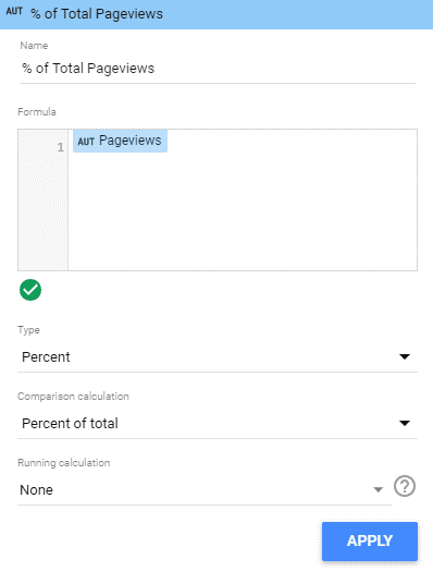
How about another simple example, this one not even requiring math. Looker Studio lets you select a comparison calculation, for example, the percent of the total. We can add any metric we want. Let’s say “Pageviews,” and do the %of total comparison calculation. Now, when we add this custom field to a chart, we’ve a new data point to look at. It’s a simple calculation, one they may have already been intuitive, but it’s still helpful to see on the chart.
There are a handful of comparison calculations including difference from total, percent difference from total, percent of max, difference from max, and percent difference per max.
Unfortunately, it’s not easy to use formulas and syntax on Google Analytics data as so much of it is already aggregated (for example “Pageviews” is actually the sum or total pageviews). However, if we were working with raw numbers, data pulled in from a Google Sheet, or ecommerce sales, we could use common data analysis syntax like SUM, MEDIAN, MAX, etc, to create new fields to display in the chart.
Let’s look at how you could use a calculated field on a dimension. Since you can’t use math on a text field, these formulas do require a little more syntax to be useful.
Here’s a simple example: UPPER(). Using Upper creates a new field that capitalizes all the text in your dimension. So if we want to capitalize all the country names in our data, our formula would simply read UPPER(Country).
So maybe that’s not too helpful, but it does explain some of the syntax, namely an operator next to the dimension in parentheses. Here’s a more helpful command. Using the operator CASE, we can change the text when it matches certain criteria.
CASE
WHEN Country IN (“United States”, “Canada”, “Mexico”) THEN “North America”
WHEN Country IN (“England”, “France”) THEN “Europe”
ELSE “Other”
END
In other words, when it’s the case that the “Country” dimension contains these fields, then relabel them as North America, or Europe. Every other country, just call “other”. The CASE helps us isolate specific values we want to pay more attention to and reduces everything else to “other”.
Calculated fields are a rabbit hole without a bottom, so we’ll leave it here for now. Be sure to check out this list of available function syntax that Google’s created.
You can also check out our dedicated article if you want to learn more about calculated fields.
Another expert tool is blended data. So far, we’ve assumed that a chart can only handle data from a single data connector. So a chart with Google Analytics data can only display Google Analytics data, and a chart with Search Console data will only show Search Console data.
Blended data allows you to display multiple data sources in a single chart.
With blended data, we connect multiple data connectors into a single chart, picking and choosing the specific dimensions and metrics we want to pull. Blended Data must follow a few simple rules to work.
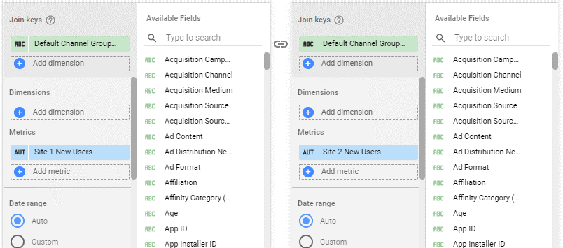
Let’s do an example using the “Default channel grouping” dimension as the Join Key. We want to know which acquisition channels are performing the best across multiple sites. After setting the Join Key, we can pick metrics we want to compare. For now, let’s say “New users.” We’re going to relabel the metrics as Site 1 New users and Site 2 New users so we don’t get them confused.
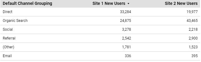
Now, to build our table, we have three data points to work with – default channel grouping, Site 1 new users, and Site 2 new users. Plugging those into the chart, you see that it displays only one column for “Default channel grouping,” as this is constant across both sites. Then, each “New user” metric has its own column. This data is now easier to compare as it’s side by side within the same chart, not living within its own unique chart.
Time to throw out the rules you just learned about Join Keys. Sometimes, you don’t need it, like when you’re specifically pulling in data to use in a calculated field. I’ll give you a specific use case where I used this functionality. We ran an integrated marketing campaign for a client comprising retargeting web ads, social posts, YouTube videos, and email marketing. Some of that data we stored in a Google Sheet, others we kept in the platform and used data connectors to pull them into Looker Studio.
We wanted to show a funnel starting with impressions, then engagements, and finally % engaged users. As such, each stat needed to combine the data from our various marketing channels to create a single metric we’d display in a Scorecard chart.
So, we blended the data for each Scorecard, first pulling all the impression data from each channel. These had different names. For web ads and social it was called impressions. For email marketing it was our # of emails delivered metric. We didn’t worry about a Join Key since there wasn’t a constant dimension that united the charts, nor were we planning on displaying a table that would need a dimension.
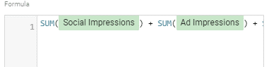
After blending the data, we followed the steps to create a new calculated field with a formula like SUM(Ad Impressions) + SUM(Social Impressions) + SUM(Video Impressions) + SUM(Emails Delivered) to get a single metric we called “Campaign Impressions”. We then repeated the steps for engagements and % engaged users. We could have done all this behind the scenes in a spreadsheet, but by using data connectors in Looker Studio, the data was live and automatically updated as we got new impressions from each channel.
One last expert tool to touch on is the Regex filter, or as Looker Studio refers to it, RegExp. Regex is short for “Regular Expression”, an algorithmic tool to find patterns in text values. It’s easiest to see how Regex works by comparing it to the other filter values.
Remember filters from just a few minutes ago? Let’s say we’re building a filter where we only want to include specific page titles. We set up our filter and can choose to see results that “Start with”, “Contain”, are “Equal to (=)”, etc. We expect Looker Studio to search all of our Page Titles using that criteria and to display only those values that match.
In that list, you’ll also see “RegExp Match” and “RegExp Contains”. These function in a similar way, but instead of looking for specific values, it looks for certain patterns. For example, we could ask Looker Studio to only show “Page Titles” shorter than X amount of characters.
RegExp has its own specific syntax that we can’t explore fully here. However, this case study on short tail and long tail SEO keywords can help explain when you might want to use RegExp.
While we’ve touched just a little on styling. It’s time to dive deeper. After all, one of the three core purposes of Looker Studio is visualizing.
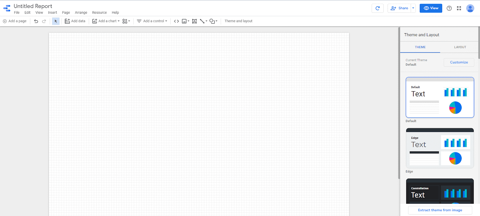
Looker Studio makes it easy to edit your report with turn-key themes. Themes alter all your charts and other elements on the page to follow the same color scheme. Click on the “Theme and Layout” button on the toolbar to open up the theme selector. On the right sidebar, you’ll find a number of color schemes to apply to your dashboard.
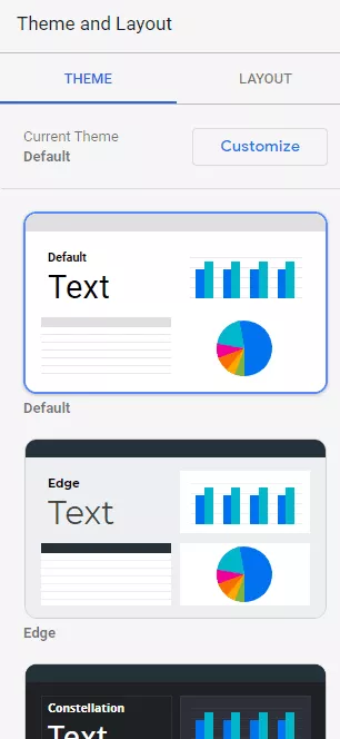
Of course, you can also customize the theme yourself. In the editor, you can set backgrounds, borders, accents, and other colors. You can also edit text styles, border shadows, default chart palettes, and contrasts.
One final tool you should know is a neat feature that extracts a theme from an image. By uploading or inserting a URL, Looker Studio will create a color palette based on the image’s colors. It’s a quick and easy way to set up a theme.
Check our this article on how to create a branded Google Data Studio theme.
A theme might help make your charts look pretty, but what if you don’t even know what charts to start with? That’s where a template comes into play. A template is a Looker Studio dashboard complete with charts and tables waiting for you to plug in your data. Additionally, most templates already come with a theme and style. All that’s left for you to do is add the data connectors.
Like the data connectors, these templates come from two sources: either created by Google or a third party. Google has over 30 templates to choose from. These often correspond to one of their products like Ads, Analytics, YouTube, or Search Console. Templates made from Google are handy for a few reasons. First, it’s connecting to their products, and they know what data you should be looking at. Second, they’re free! However, you might find them lacking in visual quality and thematic elements.
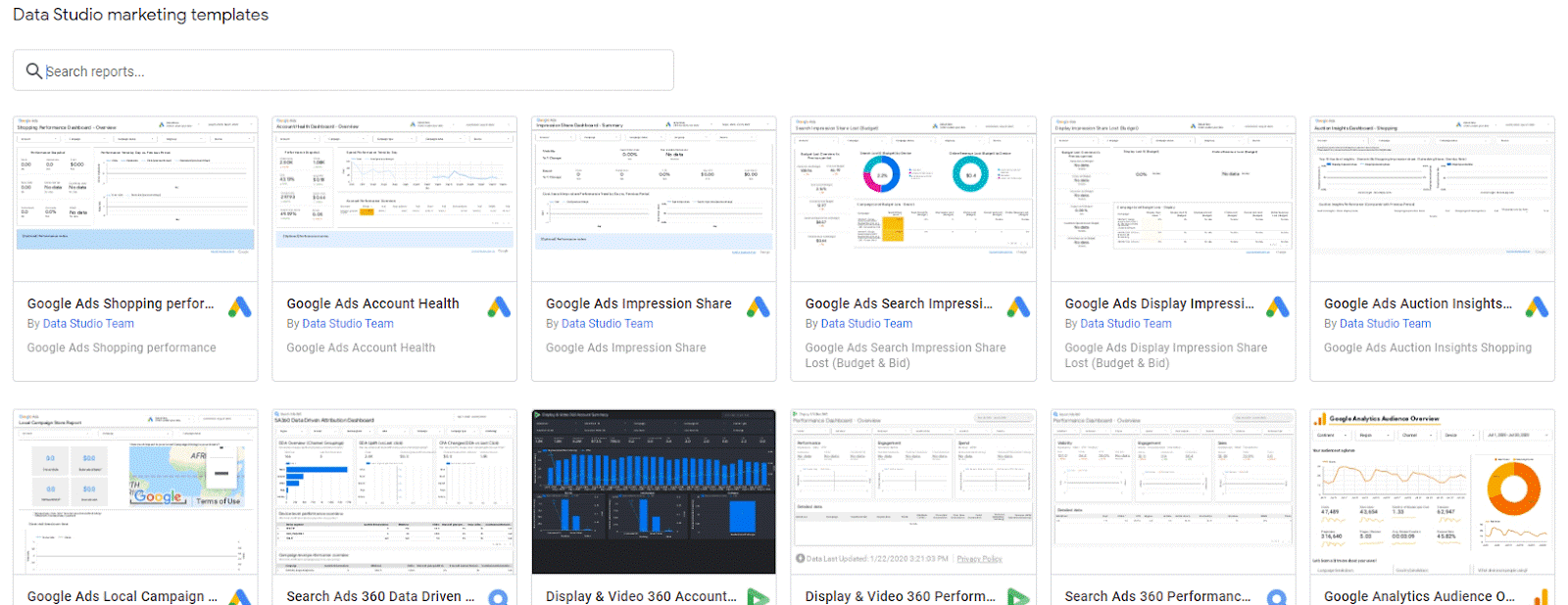
On the other hand, third-party templates tend to look a lot nicer and can be just as helpful. You’ll find that third-party templates can be more creative and often pull in data from more than a single source. Companies who create Looker Studio templates also have expertise in data analytics and, by virtue of what charts they include, can help you visualize the right metrics. Some third-party dashboards are free while others require payment, usually a small one-time fee. Our marketplace has 100’s of custom made templates (and other marketing resources) to choose from that will save you a ton of time getting started.
Whether you use a theme, a template, or build a dashboard from scratch, layout matters. It’s up to you to determine how you present your data. Should you include many charts on a single page, creating a data cockpit? Should you make a tall, vertical page that requires scrolling but allows the story to unfold as you scroll? Or should you use multiple pages with limited charts on each?
There’s no right or wrong way to design your dashboard. You’ll even find that templates follow different layouts. Just because there isn’t a right answer doesn’t mean there shouldn’t be an intentional design. As a data visualizer, your goal is to help your audience find and explore data in intuitive ways. Design with your audience in mind, understanding their curiosity, technical limitations, and purpose for looking at the report.
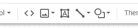
There’s one more set of tools to cover concerning the visual side of Data Studio. These don’t have a name to describe them as a group, but you can think of them as design tools not related to the charts or themes. There are five: url embed, images, text boxes, lines, and shapes. Each of these can enhance the visuals on your dashboard. Various templates, both from Google and third-party, make use of all these extra touches.
The URL embed let’s you drop in a website in a resizable box within the dashboard. Let’s say you want to show the home page of your site. You can add a url embed, choose a size, and display it live within the report. Note that the audience can’t resize the box themselves. Make sure everything fits!
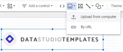
Images are perhaps the most useful element in this list and have a variety of use cases. You’ll often see images used to present a logo. Another popular use is for icons representing different metrics or dimensions. Sometimes an image is used as a background for an entire report and made to look seamless with the charts. Data Studio allows you to bring the image forward or backwards so that it can live behind or on top of different charts or even other images. Finally, you can make images “report level” so that they’ll live on any new page, a quick way to create a header so you don’t have to repeat work with each additional page. In fact, you can make any element in Data Studio “report level”.
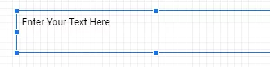
The text box is just what you’d expect – a way to add text, be it a header or a long bit of copy, to the report. The text box comes with its own style editor and will be adjusted according to your theme, just like a chart.
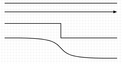
A line can be a fun way to connect charts visually. Data Studio offers four types of lines, a basic line, an arrow, an elbow connector, and a curved connector.
Right now Data Studio only supports rectangles and circles. You can resize them, choose colors and borders, and bring them forward and backwards like an image.

The final step in Looker Studio’s three-part mission is sharing. You’ve connected data and created a compelling visual display. Now it’s time to let your audience see it, whether that’s a manager, a company executive, an agency partner, or your marketing team.
Data Studio has advanced sharing capabilities which make it superior to competitors in a number of ways. First, since it’s web-based you can share a live link that presents live data. This is useful for agencies who want their clients to see live updates. Second, it means your audience doesn’t need any software to see the data aside from a web browser. Finally, it can be shared with a variety of audiences, including anyone with the link or specific email addresses you allow. Those with view access only see the front end of the report, not all the configurations you have going on in the background.
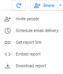
Additionally, Data Studio offers two more ways for you to share your data.
After enabling embedding, Data Studio will generate an iframe code snippet you can use to drop the report into another site or onto a WordPress page. Using an iframe keeps all the same functionality as the real report. Users can hover over data, use your controls, metric sliders, and other extras analysis tools you’ve baked into the dashboard.
If you want to make sure the report stays top of mind for important stakeholders, you can schedule them an email delivery. Select a time, frequency, recipient list, and even customize the email message and subject line. Data Studio emails a PDF version of the report as frequently as you’d like so no one ever misses your data.
Now that you’re familiar with the basics of Looker Studio, the next step is to start building your own dashboards. Here are a few more resources that can help you get started. If you’re just getting started, rather than build a report from scratch, we recommend that you work off an existing template. You can do plenty of customization to take an existing report and adapt it to your needs. To make this easier we’ve compiled a list of The Best Looker Studio Templates of 2024.
This article mostly dealt with connecting to Google Analytics as a data source, but if you are looking at connecting to other data sources we have more resources available. For example you can read our guide on ways to connect to Facebook Ads or pull in all your data from Google Sheets.
We also have a great walkthrough on how to build a sales report for your small business which is a great resource for anyone running an ecommerce site.
Finally, if you need assistance building out a custom dashboard, check out our custom build service.