Menu

Marketing reports are more than just numbers on a page – they help us process and highlight information. For agencies and markets, they communicate strategy and show value.
Well-designed reports pull numbers from spreadsheets to tell the story of your strategy’s success, point out areas for improvement, and guide future decision-making. Report design is for much more than just appeal; it influences how important information is understood, valued, and remembered.
Design is more than just beauty or aesthetics – it is about usability and functionality. Design is form and function, working together for a purpose. The aesthetic component of a great design is a secondary benefit that aids usability.
A beautiful report that lacks clarity or buries critical insights under layers of decoration isn’t effective. The true value of design lies in its ability to enhance the reader’s comprehension, helping them focus on the message rather than getting distracted by flashy visuals.
While good design seems self-explanatory, it is quite difficult to achieve. In a field that can be quite subjective, there are some aspects that are more objective than others when determining if the design of something is good or not.
Irrespective of whether marketing reports are going to be circulated through Email Marketing or Social Media campaigns, their design must be compelling and memorable. A well-designed report not only communicates key metrics effectively but also leaves a lasting impression, ensuring stakeholders remain engaged and invested in the results presented.
When it comes to using and understanding the contents of a report, good design requires the following:
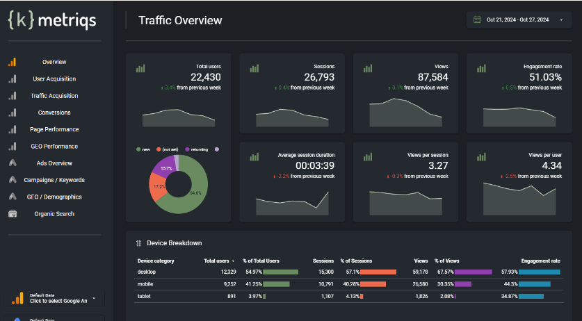
In this all encompassing Looker Studio Template, the data and metrics are extremely clear. At a glance, you know exactly what data you’re looking at, the period the data is from, a comparison to the previous period, and green/red color indications of whether the performance of a certain metric has increased or decreased.
The left-hand navigation contributes to the ease of use of the report. Icons quickly reference the source of the data (Analytics vs Ads vs Search Console) with descriptive headings beside them that imply a deeper dive into those metrics.
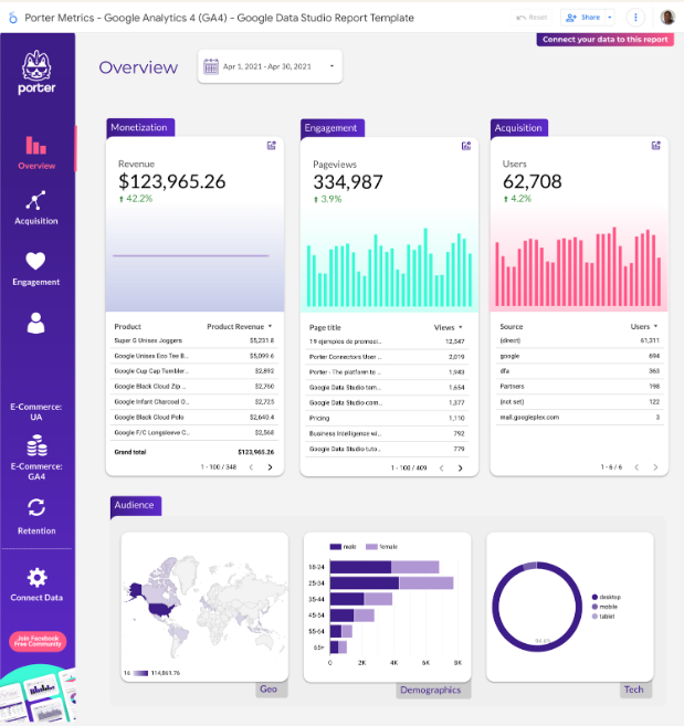
Ease of use and clarity do not mean ugly; you just need to find the right balance of aesthetics and functionality. A great example is this Multichannel Digital Marketing Report Template for Google Looker Studio. The data, navigation items, and labels are all clear and descriptive.
Functionally, the report is very easy to navigate and consume while still being very pleasant to look at. The high contrast between the white and purple makes the data easy to read, and the subtle gradients behind the charts add visual appeal without detracting from the data.
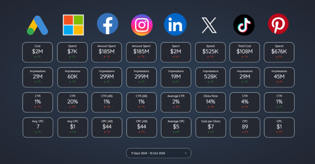
The difference between a good report design and a great report design can come down to how intuitive it is to use. Take the Ultimate Ads Dashboard in Looker Studio as an example. The information is clearly and logically structured so you can quickly and easily compare the performance of different ad platform metrics.
When it comes to using it yourself, you notice the intentional design decisions that make a report like this so intuitive. While there is a list of navigation items in a menu on the side, you can also use the Ad platform logos themselves to navigate through the report. Clicking on the Instagram logo takes you directly to the Instagram Ads page, which shares much more details than the overview.
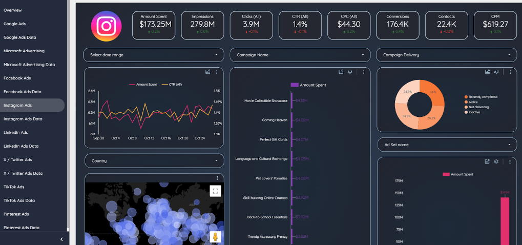
Updating a filter, such as the Campaign Name, updates all the metrics automatically to only show you exactly what you are looking for.
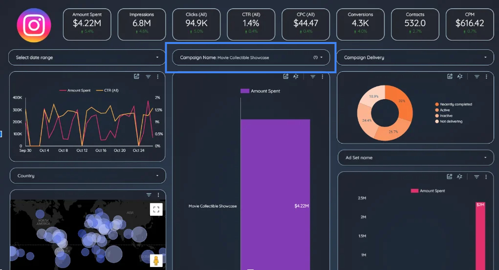
While additional graphics could add to the visual appeal, they can also be distracting. The point of a report is to get information across as intentionally as possible, and having unnecessary elements can inhibit this goal.
A great example is the Full Screen Dashboard Looker Studio Template.
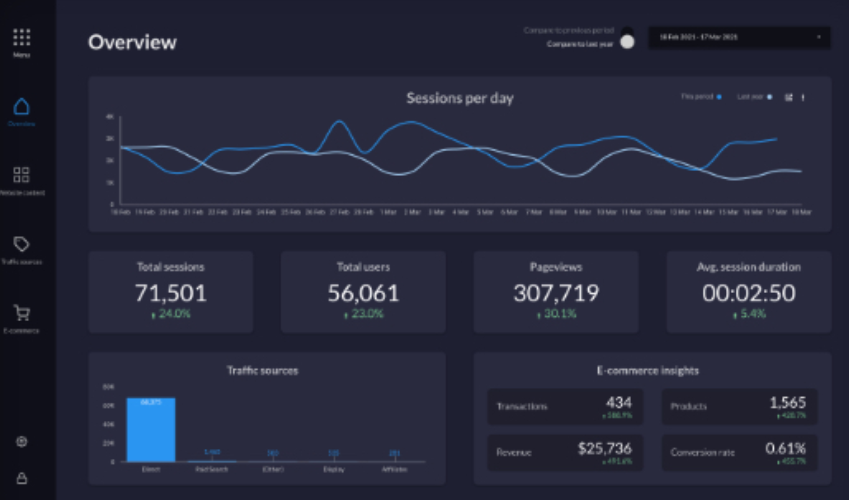
This report looks good while only showing the information it wants to get across in a very clear manner.
The icons are minimal yet clear and descriptive, and the charts are clearly separated with good contrast between the back and foregrounds, all while being really easy to look at and consume without any distractions.
It ultimately doesn’t matter if your reports are being built off data from Instagram, Amazon or Shopify because the fact remains that the report will only be as useful as the design allows it to be.
Here are four of the most compelling reasons why a good design is worth your time.
Most marketing reports, like e-commerce analytics reports or PPC reports, are very data-heavy. Getting through the information and identifying what the data is saying can be exhausting. Good design helps break down this information so that it is easy to understand by making use of:
Ultimately, it reduces the cognitive load (which refers to the amount of working memory resources used) needed to process the report information. Our brains are wired to process information in specific ways, such as recognizing patterns, colors, and visual hierarchies. Even when dealing with hyper-rational data like financial reporting, design still plays a crucial role in how we interpret information.
Research by Claudia and Shu found that the design of financial reports impacted investors’ likelihood to invest in a company and their perception of share value, regardless of their experience as an investor. Therefore, no matter the industry or audience, good report design is important.
Effective design reduces cognitive load by removing clutter, using familiar patterns, providing clear feedback, and simplifying language. Consistent, minimalistic visuals and straightforward content make reports easier to navigate, helping readers focus on essential insights without distraction.
Hundreds of studies over the years have shown that the way in which information is presented has a direct effect on how well information is retained. A few of these theories include;
The more information the audience retains, the greater the report’s impact on driving meaningful change and results and the more effective the person or agency who created the report is seen as.
Knowing that you are providing value is not enough as a consultant. There must be sufficient buy in and understanding from the client. This is why our jobs as consultants is about more than just providing recommendations.
“There is a lot of power in process. It is a tool of reassurance.” – David C Baker
The design and way in which you create reports is a key aspect of communicating value and getting buy in from your audience. In Claudia and Shu’s report, their research shows that people often notice small, unrelated details that companies show them and that we naturally appreciate things that look good. Regardless of the category, our bias towards things that are visually appealing exists.
The article, 13 Stunning Annual Report Examples (And How They’re Made), outlines 13 annual reports and explains how report design has changed over the years with newer technologies. The trends in visual storytelling and interactive design have raised the bar for what is expected when receiving reports.
As an agency or a marketer presenting a report to a company, simply having a better-designed report will increase the perceived value and assumed effort put into that report.

Design can be used to tell a story by strategically using elements like color, typography, layout, and visuals to guide the viewer’s attention and evoke emotions. In a report, design sets the tone, emphasizing key data points while creating a flow that naturally leads the client through the narrative.
Data visualization is subjective and can strategically be used to communicate a narrative. The data used, and the way in which it is put together can guide the viewer to see patterns or draw certain conclusions.
Color, layout, and text elements can influence how infographics are understood and perceived. By using well-designed visuals like graphs and charts, complex data becomes more digestible, memorable, and impactful. Intentional design can make the report feel cohesive, turning raw information into a compelling narrative that resonates with the client, allowing them to better understand the impact of your work.
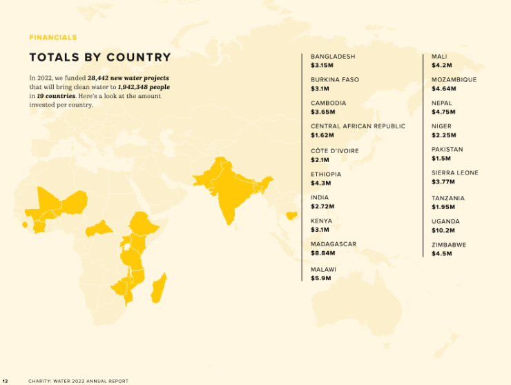
See more examples of well-designed annual reports here.
Regardless of the industry you’re in, marketing reports play a fundamental role in how information is shared, how decisions are made, and the perception the reader has of the work done. Our ability to understand and read information in certain ways is innate and hard-wired. Even when ‘design shouldn’t matter,’ it does, so don’t miss out on the opportunity that comes with investing in good report design.
We know how important reporting is in the marketing space so we’ve curated the best marketing templates by reviewing hundreds of options. You can read our article, on the best ecommerce looker studio reports, check out our sales report templates, or if you’re looking to improve your own reports, here are 10 Useful Google Sheets tips for digital marketers.
Get a Premium GA4 Template for FREE
A marketplace to buy and sell 100’s of high quality templates, dashboards and reports from Looker Studio templates to Contracts and SOWs. Instant download and product support is what sets us apart.