Menu
View Images
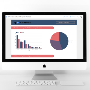
If you’re trying to gain a deeper understanding into your users demographics and how they engage with your website then this product is basically made for you!
With this report it’s all about following the flow! It’s designed in a flowing visual style to make it easy to follow and understand the steps of user interaction.
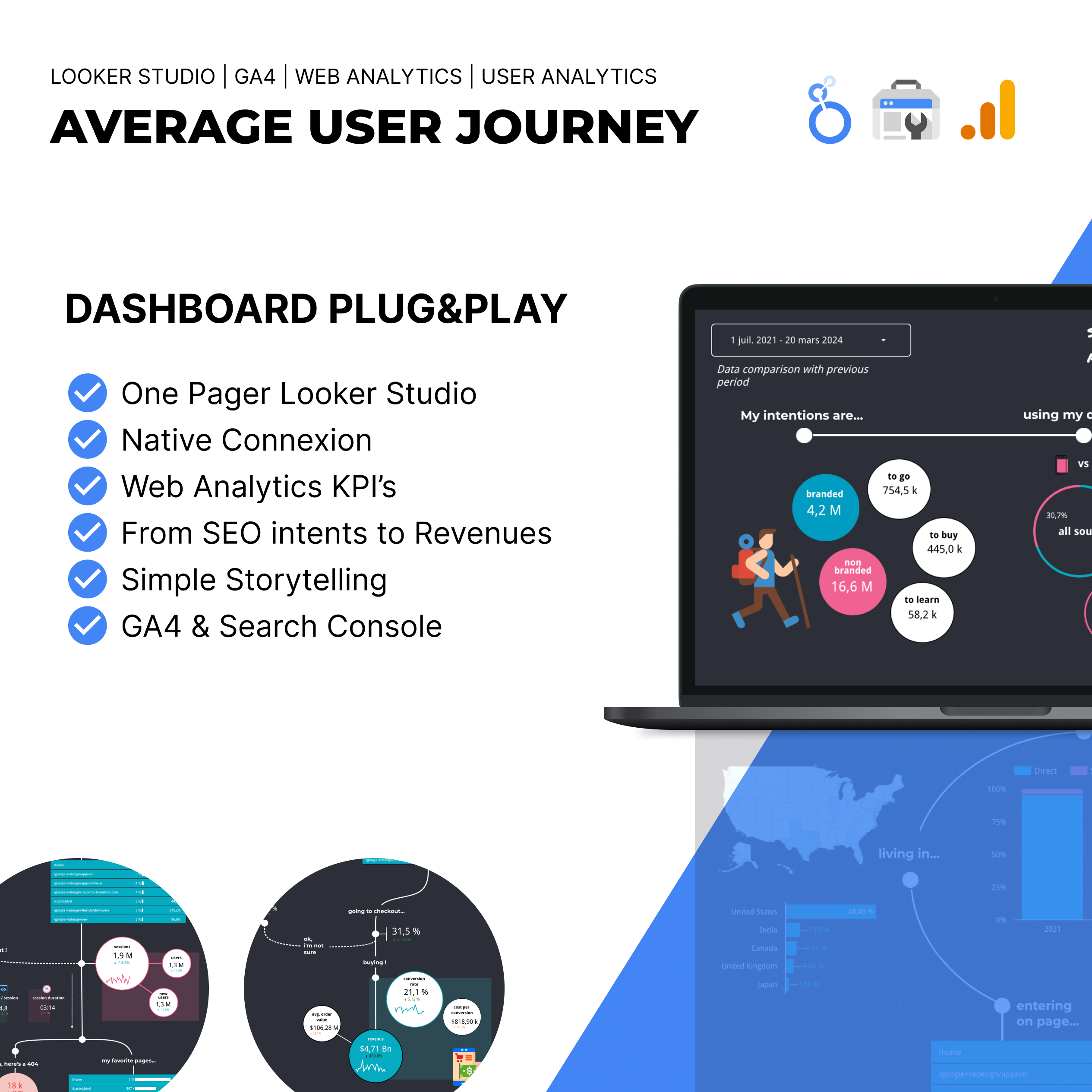
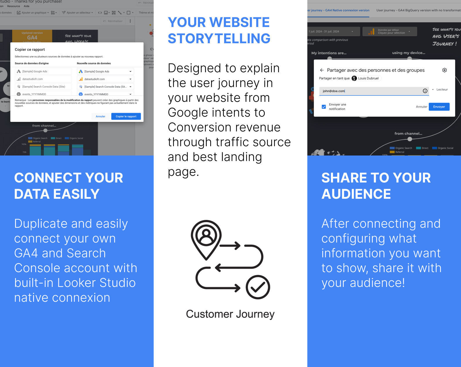
As a bonus it includes interactive features, easy connection with Google Analytics 4, Google Ads and Search Console and cutting edge share ability.
The ‘User Journey Looker Studio Dashboard’ boasts a number of unique and excellent features. The most striking aspect of the report is the way it is designed to guide the reader through the steps in analyzing a users journey. This provides the report viewer to be guided in a story like manner through the report and make understand the user journey easier.
It’s a great report because it is so easy to use and yet it contains a deep level of information. So analysts could benefit from it, however it’s primary audience is for less technically minded users that prefer not to trove through tables and graphs of data and have it presented to them easily. It would be ideal for website owners and high level business stake holders. It would also work well for an agency with many clients as an added level of reporting beyond a regular monthly report.
Accessing this dashboard with Looker Studio is super easy. After purchasing you will receive a link to a copyable version of the dashboard. (In case you miss the link, you will also receive a link to your email). You can follow the complete guide or these four easy steps to make the dashboard yours:
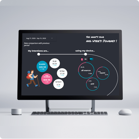
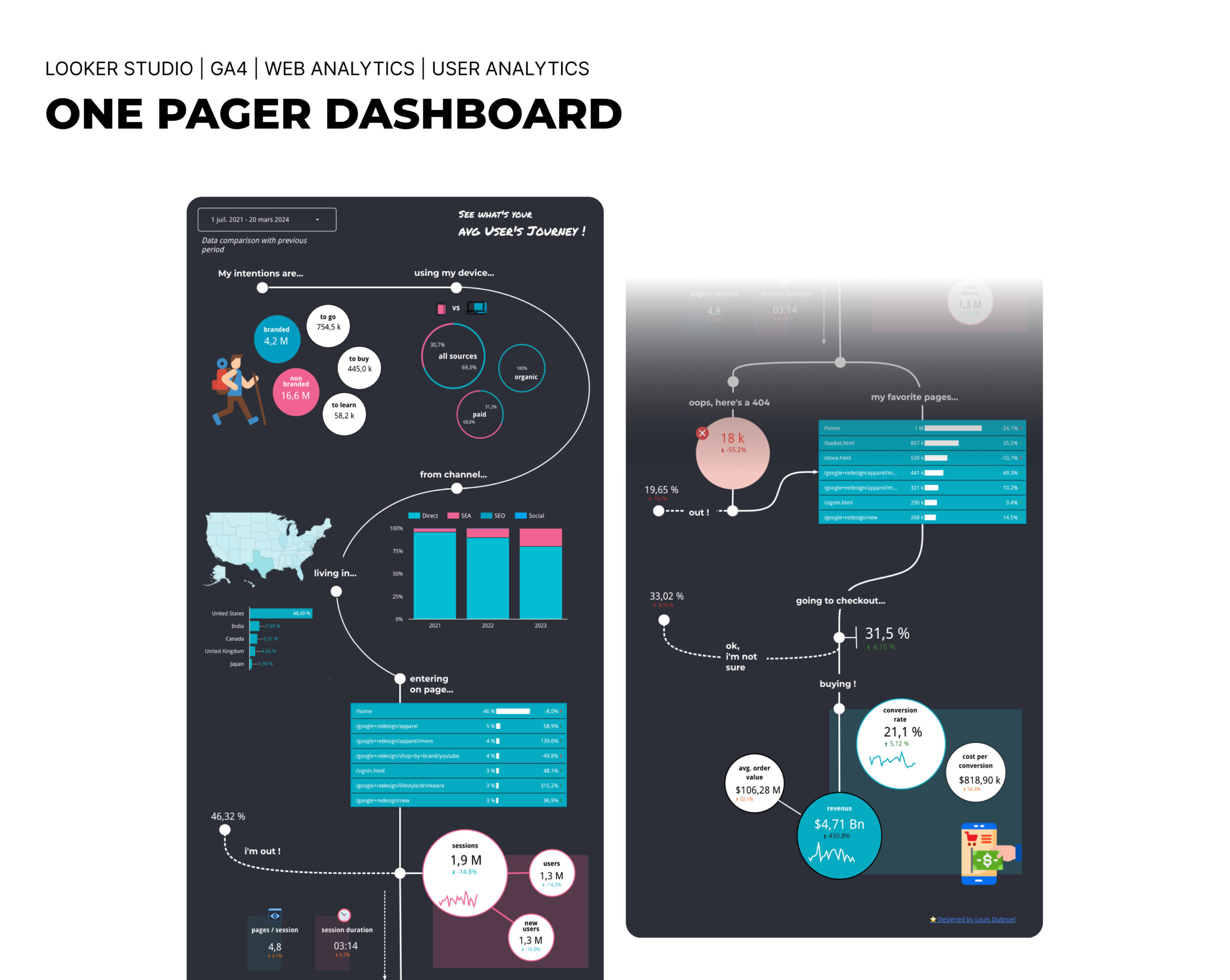
Just go with the flow! The report begins with the first steps in a user’s journey and that is keyword intention. It gives you the breakdown of categories of your users intent. The first thing to understand is whether it’s a branded or non-branded search, meaning are they typing in your brand, do they already know your brand, or what percentage of traffic is non-branded. We’d expect non-branded to be far higher, but it is useful to get an idea of the brand penetration you have with your users. The dashboard then breaks out whether its a navigational, information or transactional query: to go, to buy, to learn. This gives you a thorough understanding of why your users are coming to your site. Knowing this could help you better design your content to what your users want.
The next stage along the path is devices. It’s critical to know not only why you traffic is coming to your site, but on which device and channel. The report breaks this down. If a majority of traffic is coming from paid sources, then it can be easier to adjust intent, by bidding on different intent based keywords. Having intent and device/source juxtaposed allows you to make the insights here actionable quickly.

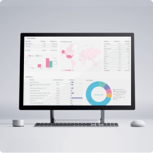
The next step along the report journey are Channels and Locations. Channels provides more insight coming down from the previous graph. This allows you to see % breakdown in traffic between the different channels as a whole.
The locations report is also very helpful in getting a view as to where your users are coming from. The location graph is dynamicaly generated based on user location. If your users are worlwide, as in the example below, you will see a map of the world. If they are only in the US, you will have a view to the locations they come from with the USA.

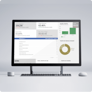
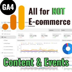
The next paths on the report provide detail into how your users interact with your page. We see a table showing the top landing pages on the site. We also see the exit rates and the pageviews per user. We can also get an understanding of the page engagement rates and what events occur on the pages.

It’s often an overlooked part of website management and user experience optimization, but crucial nonetheless – that is 404 page fixing. This report allows you to see how many users end up on 404 pages and thus helps you understand what you can do about it. On the reverse end, we are presented. with the most popular pages as well. This can help us see which content is the most loved and plan out further content ideas.

As a last step in the journey and often the most impotant, we need to understand how users interact with our cart. The report helps us understand firstly, who gets to the cart, how many drop off and how many complete the cart. Other nice data points included are avg. order value, conversion rate and conversions.

Aside from taking us on an amazing journey, along the way the report has some interactive features. At the top of the report you are able to adjust the dates of reporting. this allows you to use the report multiple times for different periods. You could analyse last months user journeys, turn this into a PDF and send off to your client. Then compare this regularly every month or year.
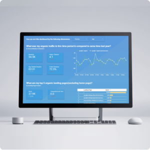
Another feature is that the report allows you to interact with it and hover over some charts and graphs to get more information. See below screenshot showing more precise time info. on hover over.

We have used GA4 Sample data from public bigquery dataset (events_YYYYMMDD). It provides a “user pseudo id” that you can use to count unique events (when concat it with ga_session_id if you have it)
Every user can give us a lot of great insight and by aggregating them together and understanding how your website is being used you can start to bind together an interesting story, ultimately helping you make the journey better for the next users to come!

Louis
200+ bought
View Images


Michel Dufour –
This looks really great and does a good job of showing how people use my client’s website. Lovely graphic design which I white label for my client. It’s clear these guys are marketers themselves. Recommended.
Derek Symons –
This is a great tool for any ECommerce store. Very easy to setup and has all the right metrics to get the low down on the customers journey from when they first visit the store, to the final purchase. Thanks, as it has saved me so much time!!
Katherine –
Awesome template. I love the design. It’s much easier for me to get insights from this report than from spreadsheets or plain reports. Highly recommended (especially for visual people)
JenniferB –
LOVE THIS
PinkFLOYD1 –
I have bought several templates from bymarketrs and also tried making some myslef. I have to tell you that this is something I haven’t seen before. I share this with my clients when they ask me about website traffic and it always get’s a good response.
It’s very easy to setup and adds so much value to my clients. I bought it once here and have used it 6 or 7 times.
I’m always on the lookout for more things like this so I’ll be back again.
craig.digital –
It was very easy to get started with this. Some of the visuals did not work as expected when I connected, I emailed support and they helped me, which was good!
Aside from that nothing bad to say here, thumbs up.