Menu


This article is a continuation of our previous article where we covered how to connect and display your Google Analytics data, creating an interactive dashboard using time series charts. In this article we are going to explore time series charts in more depth, as well as focusing on bar and pie charts.
This guide consists of 8 steps to help you better understand the various charts that Google Data Studio has to offer.
If you missed our previous article, ‘How to: Connect Google Analytics to Google Data Studio’, you might want to check it out before progressing as it provides an explanation of how to add and edit a time series chart using analytical data.
First, it’s important to include some segmentation to see which marketing channel has brought in the most traffic over a specified period of time. For this, a bar chart is the most effective data visualisation tool.
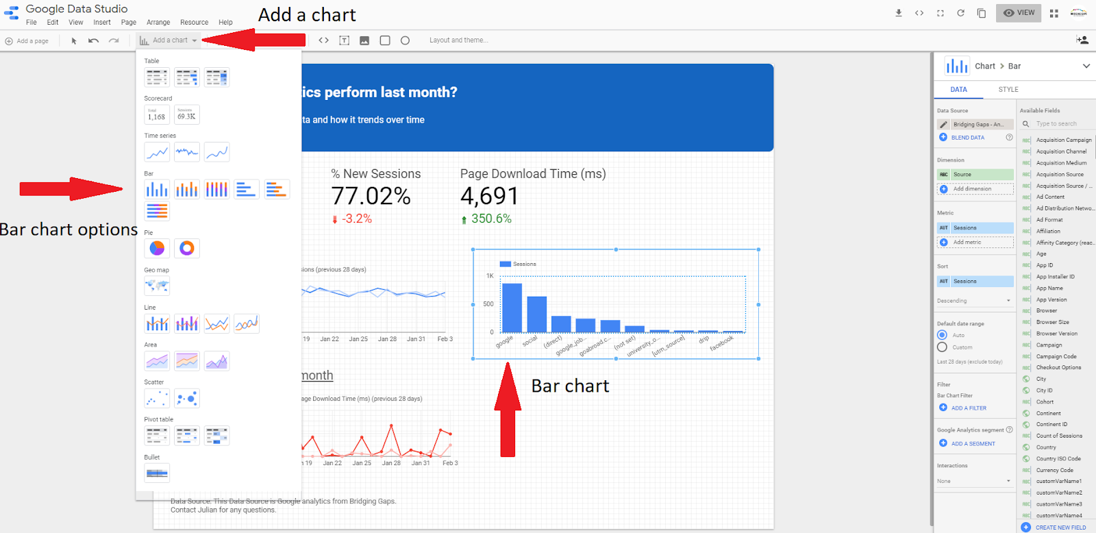
You need to select the bar chart option from the ‘Add a chart’ drop-down menu and position it wherever you feel it is most suitable on your report.
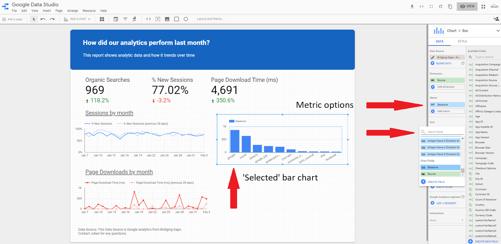
The bar chart is set to default which displays the total number of sessions by traffic medium. If you would like to change these metrics, simply click on the metric ‘sessions’ and select one from the list. It is important to note that your bar chart has to be selected before attempting to change the data.
The final thing you need to do is change the date range so that only the previous month’s data is displayed.

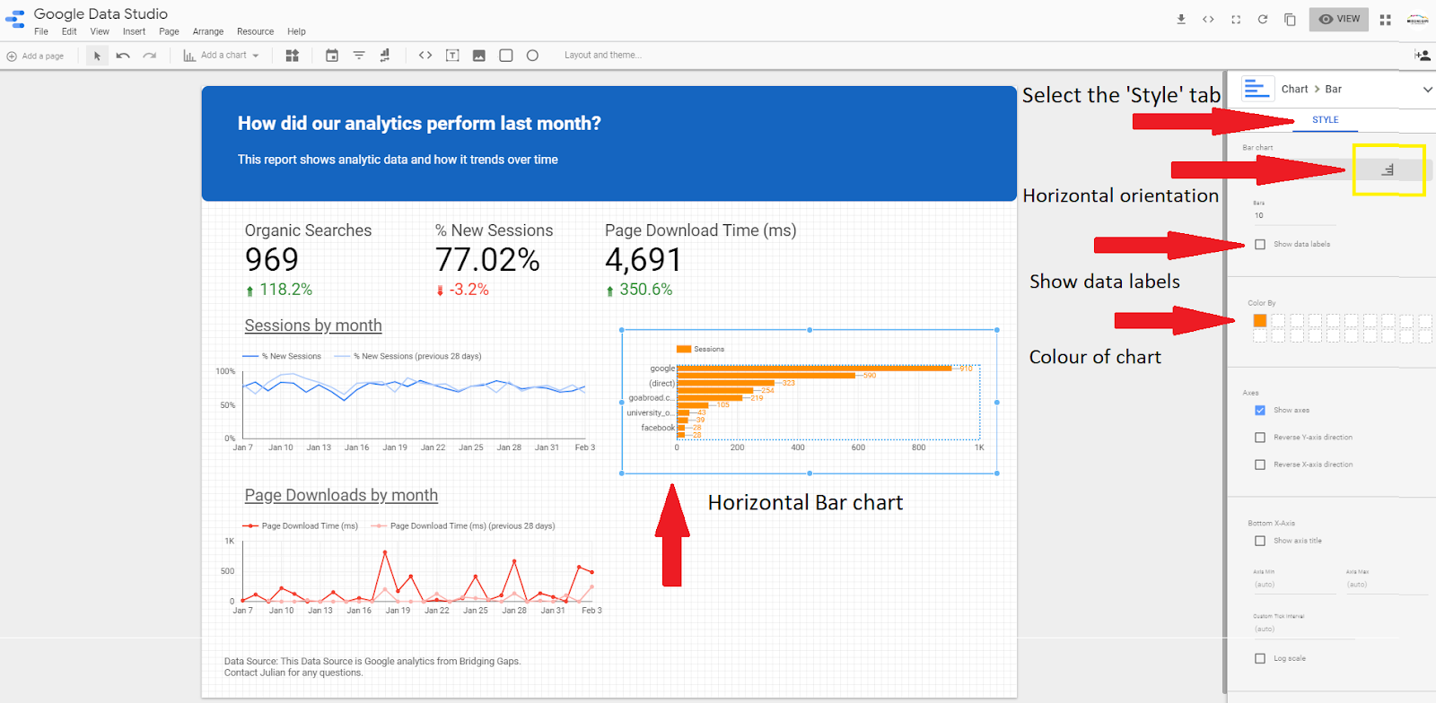
You have the option to change the orientation of the chart which could give you a better visualisation of the category names and the information displayed. In order to do this, select the ‘Style’ tab in the top right-hand corner of the report and then select the horizontal orientation. If you would also like to see data labels, so that you don’t have to scroll over the chart to see the total number of sessions, click the checkbox ‘show data labels’. Finally, you have the option of changing the colour of your chart.
Pie charts can be useful to display percentage or proportional data. Continuing with our theme of traffic via different marketing channels, it’s possible to establish the effectiveness of each channel, by using a pie chart.
To add a pie chart, simply click ‘add chart’ in the quick links and select ‘pie chart’.

For this example, the pie chart is set to default which shows the total number of sessions by traffic medium. If you would like to change these metrics simply click on the metric ‘sessions’ and select one from the list. It is important to note that your pie chart must be selected before attempting to change this data. Don’t forget to set the custom date range to the correct time period!
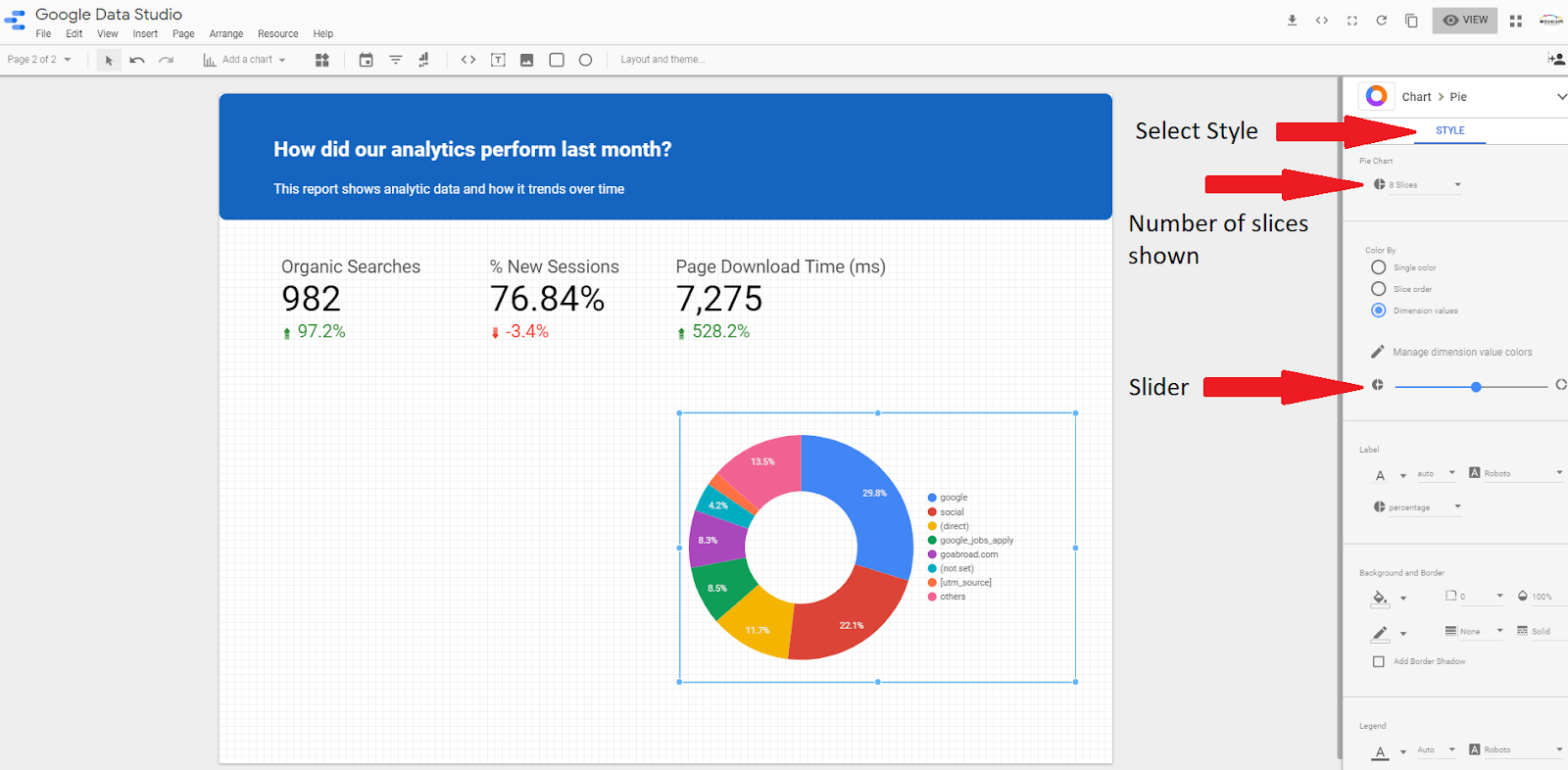
Step 6 – Pie Chart Appearancee
There are a few styling options available for your pie chart. A useful facility is to use the ‘Doughnut’ option.
This can be done by using the slider to increase and decrease the size of the hole in the middle. It is also possible to limit the number of segments shown on the pie chart. Simply select the number of segments you would like to be shown from the drop-down menu.
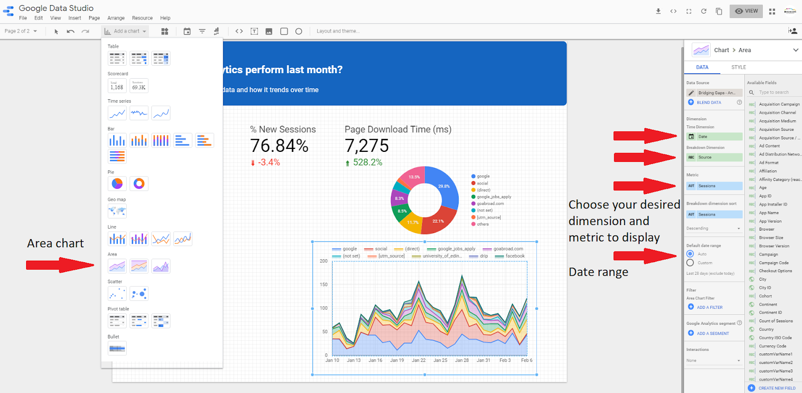
Area charts are most useful when facilitating trend analysis and are a good choice in order to see time series data broken down by categories. In this example, we would like to understand which marketing channels have contributed to the overall trend we see in traffic. Select an area chart from the ‘add chart’ drop-down menu, in the quick links menu.
If you would like to change these metrics, simply click on the metric ‘source’ or ‘sessions’ and select one from the list. It is important to note that your area chart must be selected before attempting to change this data.
To see your report as others would view it, click ‘view’ at the top right of the page. This is different from how you would see it in the edit mode. You will notice that the charts are interactive which allows you to see the data points as you move your cursor over the graphs.

Don’t miss the next article in our ‘how to’ series: ‘How to make your dashboard interactive with filters’!