Menu


In this article, we are going to learn how to implement specific data visualizations to allow you to interpret data using charts and tables. It is recommended that you read the previous articles in our ‘how to’ series before moving onto this on:.
In this article, we will be exploring 3 types of charts on Google Data Studio.
Scatter Charts
Bullet Charts
Tables
This article consists of 11 steps to demonstrate how to use these charts to visualize your data in an interactive way.
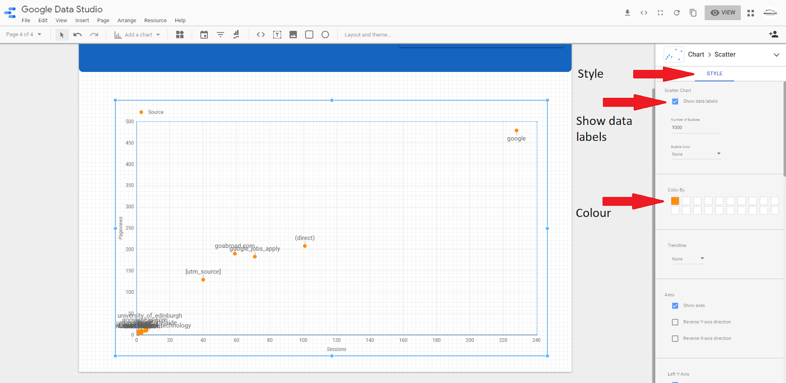
Scatter charts show how one variable is affected by another. This relationship is known as ‘correlation’.
An example of this might be a comparison of clicks per campaign or total spend per day. The position of the individual dots on a scatter chart enables you to see the relationship between two different campaigns or daily expenditures. One dot is plotted along the ‘X’ axis, and the other along the ‘Y’ axis showing you how one variable is affected by another.
1) The first step is to select the ‘scatter chart’ option from the ‘add a chart’ drop-down menu and position it on your report.

For this example, we will explore the relationship between the total number of sessions and the total number of page views.
2) The scatter chart is set to default which displays the total number of sessions on the ‘X’ axis, and total page views on the ‘Y axis’. In order to change these metrics, simply click on the metrics and select one from the list.

3) In order to identify which data points refer to a certain category of information, it is necessary to add in the product category name as a label. To do this, select the ‘style tab’ then click the checkbox ‘show data labels’. Finally, you have the option of changing the colour of the data points.
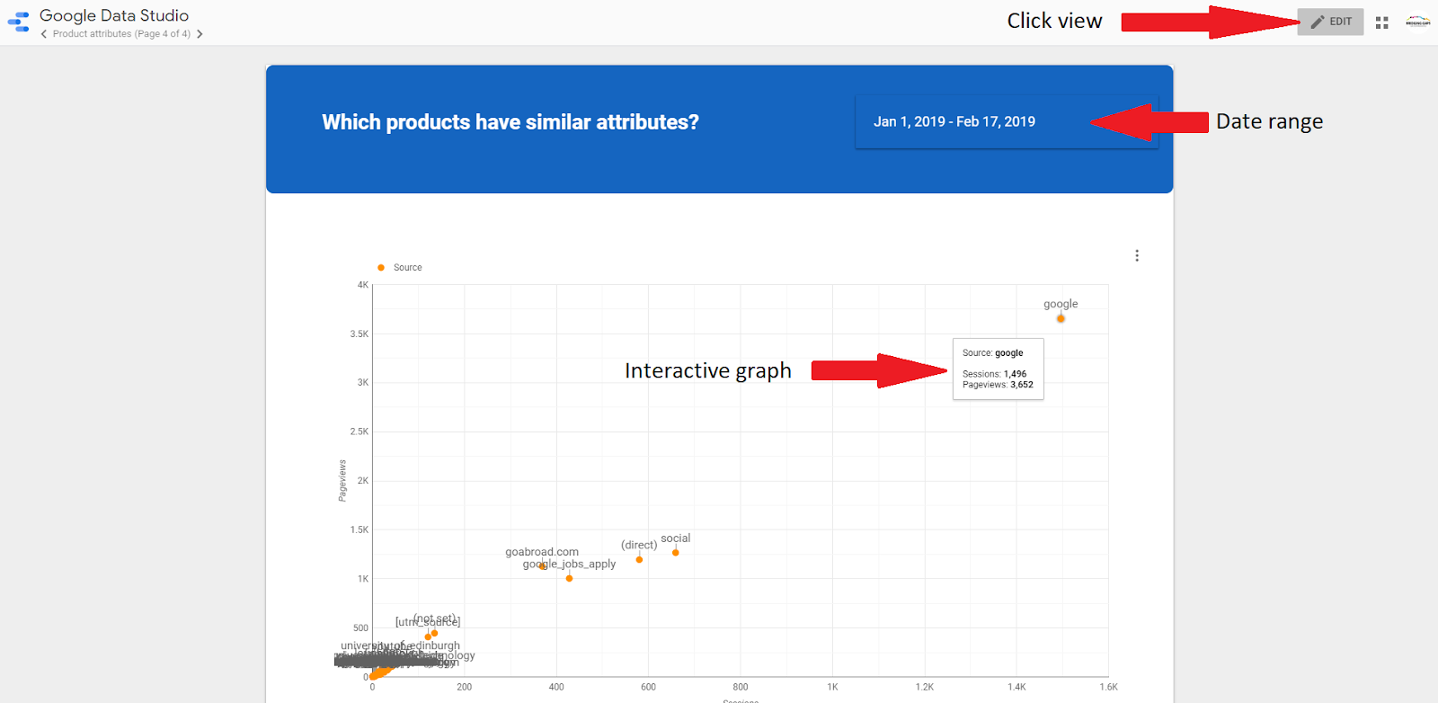
4) In order to view data from previous weeks, months or even years, switch to view mode and set the date range of your report. The charts are interactive so it is possible to see the data points as you move your cursor over the graphs.
5) Bullet charts are typically used to display performance data and display progress towards a certain goal. Ie: Revenue, expenses, volume. Bullet charts can be both vertical and horizontal.To add a bullet chart, simply click ‘add chart’ in the quick links and select ‘bullet’.
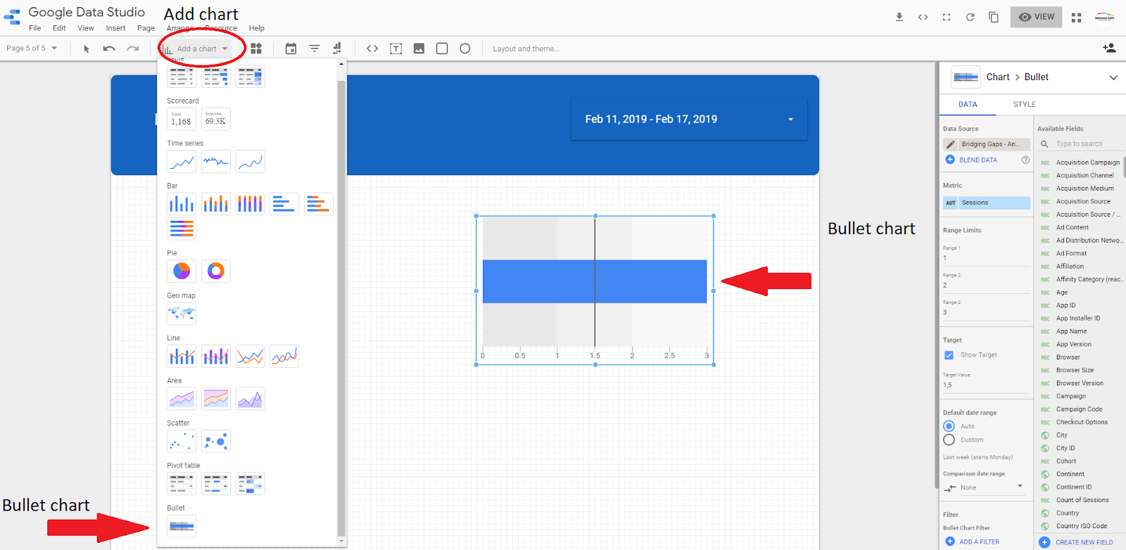
6) On the right hand side of the page, there are options to set the metrics that you want to display. The range limits set the lower, middle and upper targets for the metric.
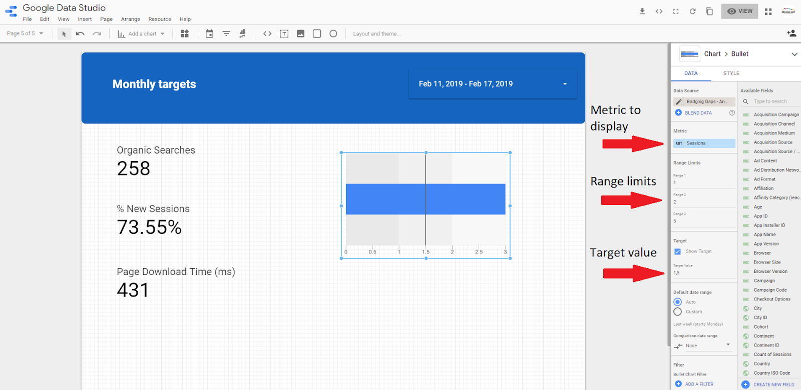
For this example, the bullet chart is set to default which displays the total number of sessions.
It is important to note that the date range needs to be adjusted accordingly.
Below the following values have been set: Target value: 4200, Range 1: 1800, Range 2: 3600, Range 3: 5400

7) It is also possible to change the colour of the metric bar and the range of the bullet chart.

8) To view your bullet chart, select ‘view’ mode in the top right hand corner of your screen.

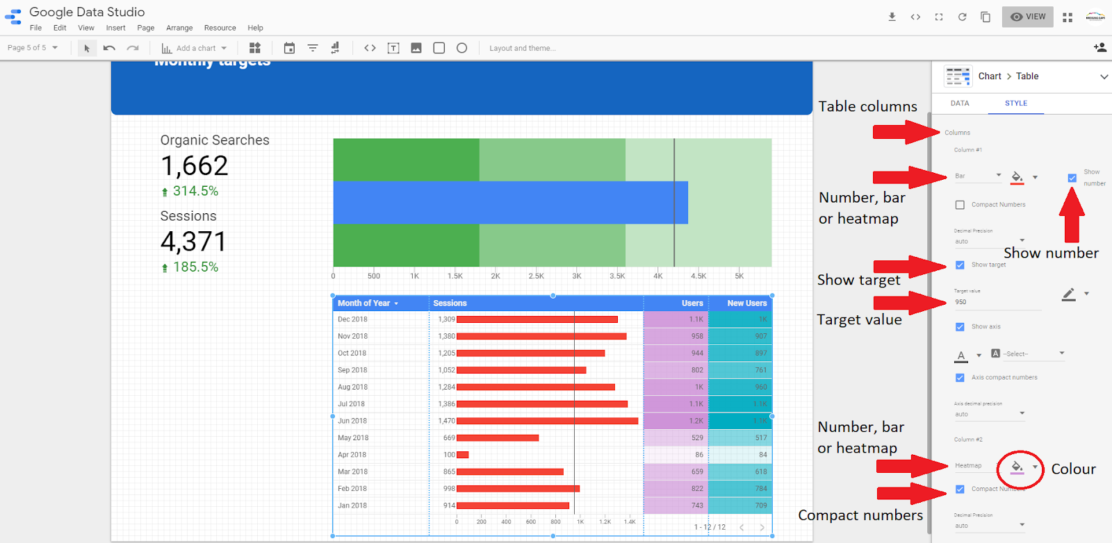
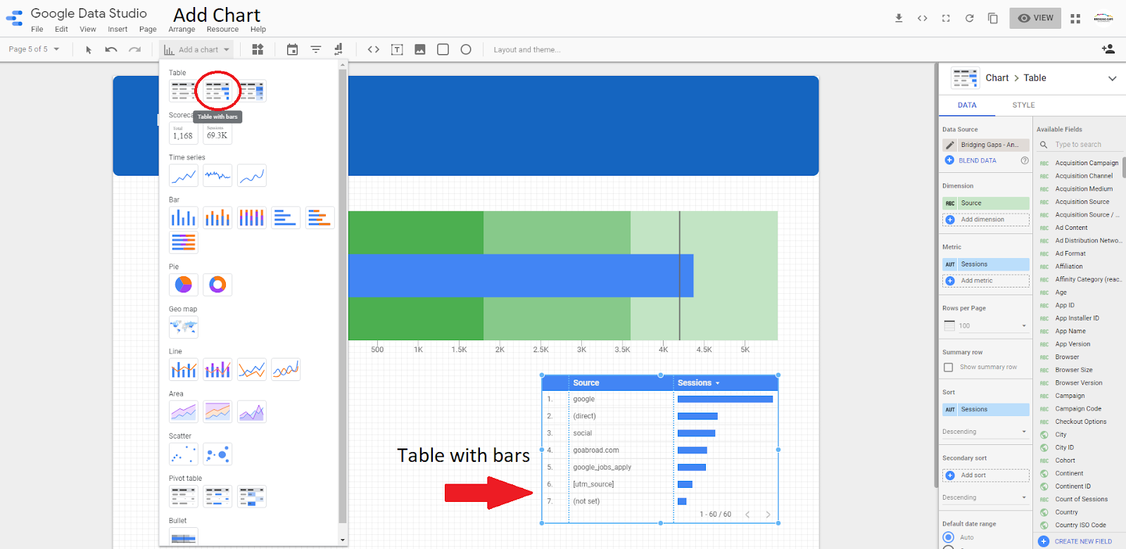
A table is used to organize and display information in columns and rows.
9) To add a table with bars, select ‘add chart’ from the dropdown menu in the ‘quicklinks’ and select ‘table with bars’.
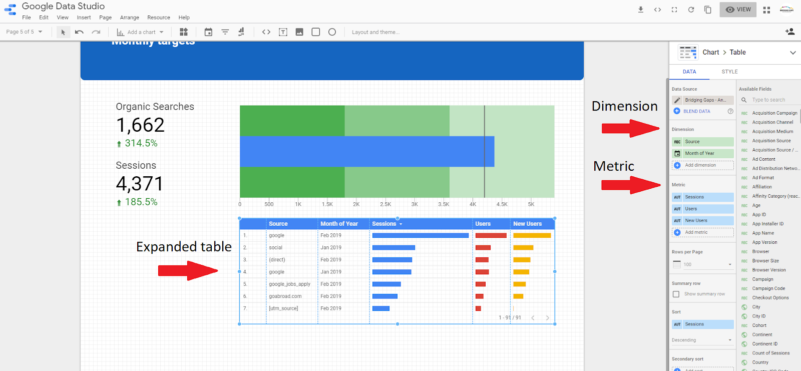
On the right-hand side of the page there are options to select different metrics and dimensions. For this example, we have added ‘month of the year’ as an additional dimension and ‘users’ and ‘new users’ as additional metrics.
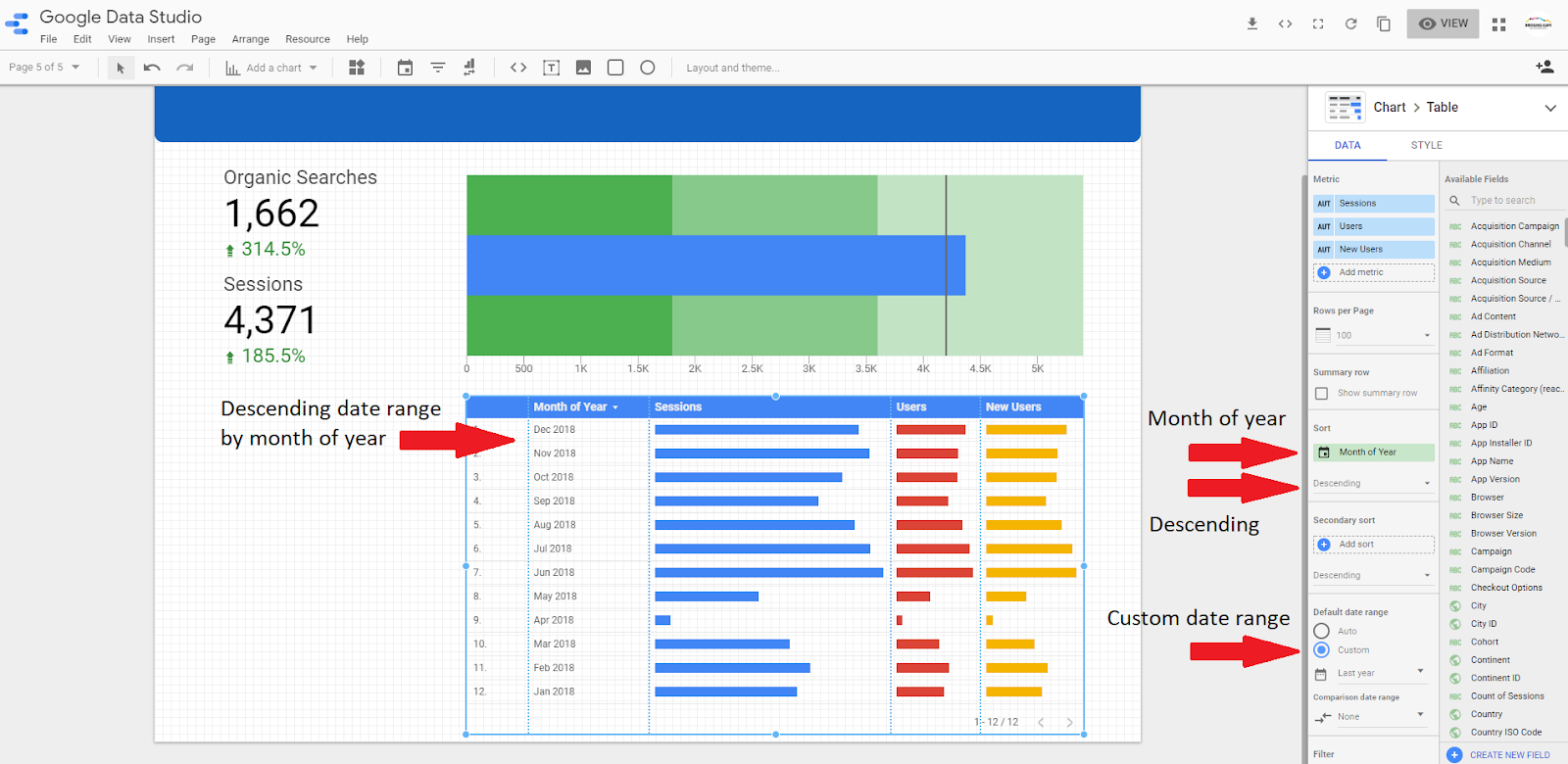
10) It is possible to view months in descending order in order to display the latest data at the top of the table. It is important to note that the date range needs to be adjusted accordingly.
It is also possible to remove the row numbers from the ‘style tab’.
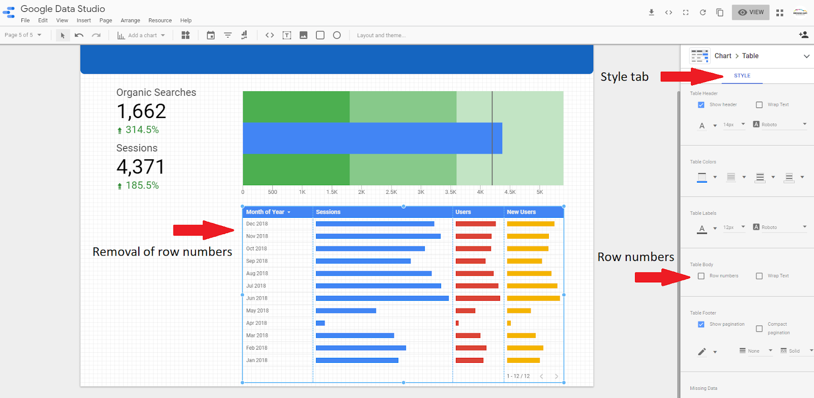
11) In the ‘style tab’ you will see a list of options for each column in the table. A number, bar or heatmap can be selected. Similar to the bullet chart, it is also possible to set a target value. The target value line will appears once the target goal has been set. It is also possible to change the colour of the bars.
All of the above options can be applied to each column of the table. Select your desired style based on the information you would like to display. In this example, we used the following options: Column 1: Bar, Target value: 950, Column 2: Heatmap, Column 3: Heatmap.